Playing With Liberty

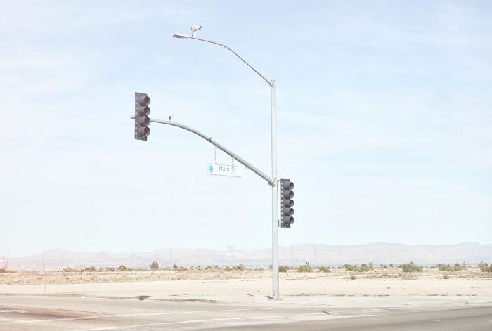
As part of my experiments with compositing topographical features I wanted to explore the possibilities of subverting well known (and possibly well loved) national architectural or natural icons.

Starting with Lady Liberty, surely there can be no better known construction that everyone instantly recognises and whose meaning could be that of great pride, wonder, expectation and hope or an oppressor. Either way most if not everyone knows what the Statue of Liberty is and where it resides.   So decided to see if I could relocate it and how that might work aesthetically within the context of my other work in progress.  Making these images appear to be as ‘real’ as possible is essential.

So I pursued two potential routes, one where I physically moved the statue to a different continent and another where I created a new route to visit it, as a new way of seeing the statue for the first time rather than approaching it via Ferry crossing the Hudson as is the way it is viewed now.

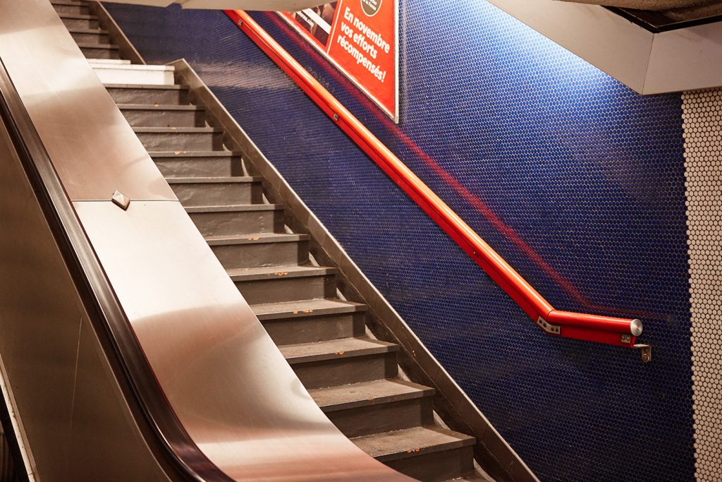
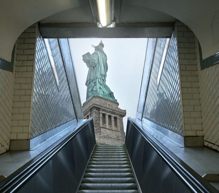
Ive imagined it being accessed from the Paris Metro system. One of the things I love about Paris is the revelation the exit steps provide,  I imagine because Paris is a relatively low rise city in most of its historic districts the city reveals itself easily, whereas in New York you rarely gain much viewing distance unless from the top of a skyscraper or looking out from beyond the metropolis.

Tourists recording their trip to Liberty Island
Liberty Island as seen from the Ellis Island ferry


My first experiments using the Paris Metro experiment with angle and scale of Liberty. The first aims to deliver the viewer virtually to the plinth base,  I imagine a row of escalators delivering tourists right to the location.

The second hints at the escalators being a little further away, maybe being at the rear of the public space where the statue is located. This feels more in tune with a publicly open space somewhere like Paris or other European city.

Although i enjoyed creating these scenes and will test them out by asking viewers if they know the escalators at the Statue Of Liberty and measuring their responses I’m not sure if it isn’t all a little too obvious.

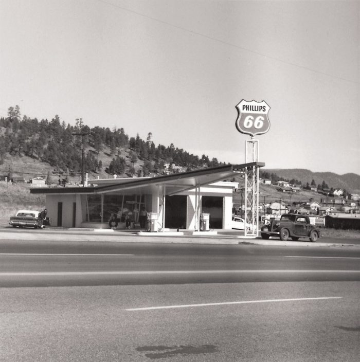
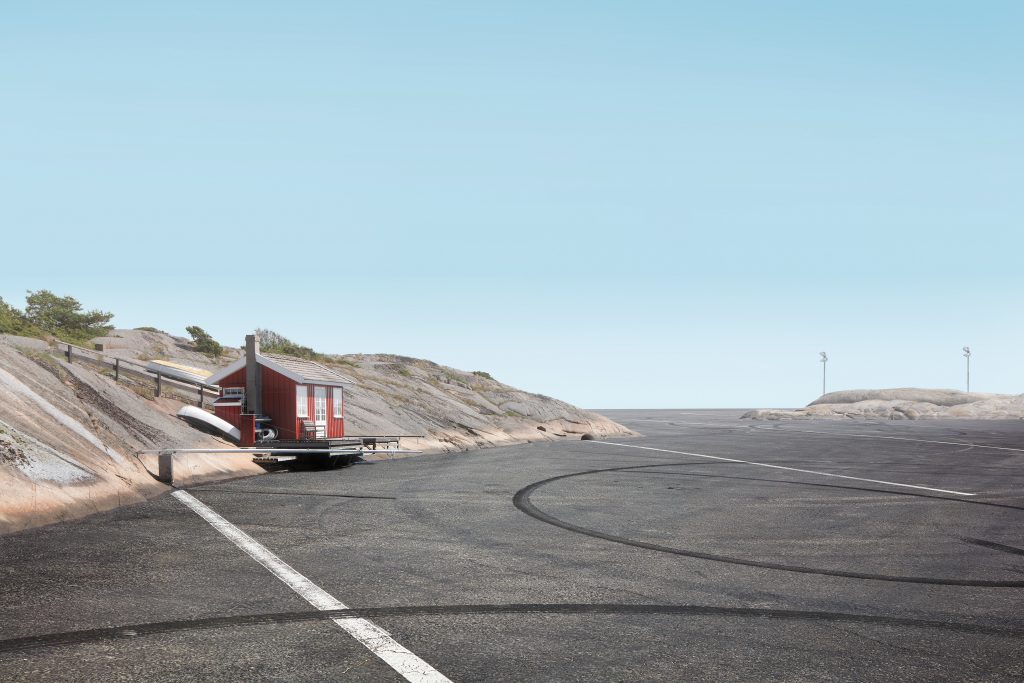
This third execution where I have relocated Liberty Island to Sweden feels more in tune with the other images in the main In Between places collection as it stands so far.  Its a change in tone and weather but I think this adds some authenticity to the images as a set.  Whilst I admire Lauren Marsoliers Transitions series I do find they lean to a very clean aesthetic which is fine but I need my places to look and feel real and weather is a big part of that recognition factor.

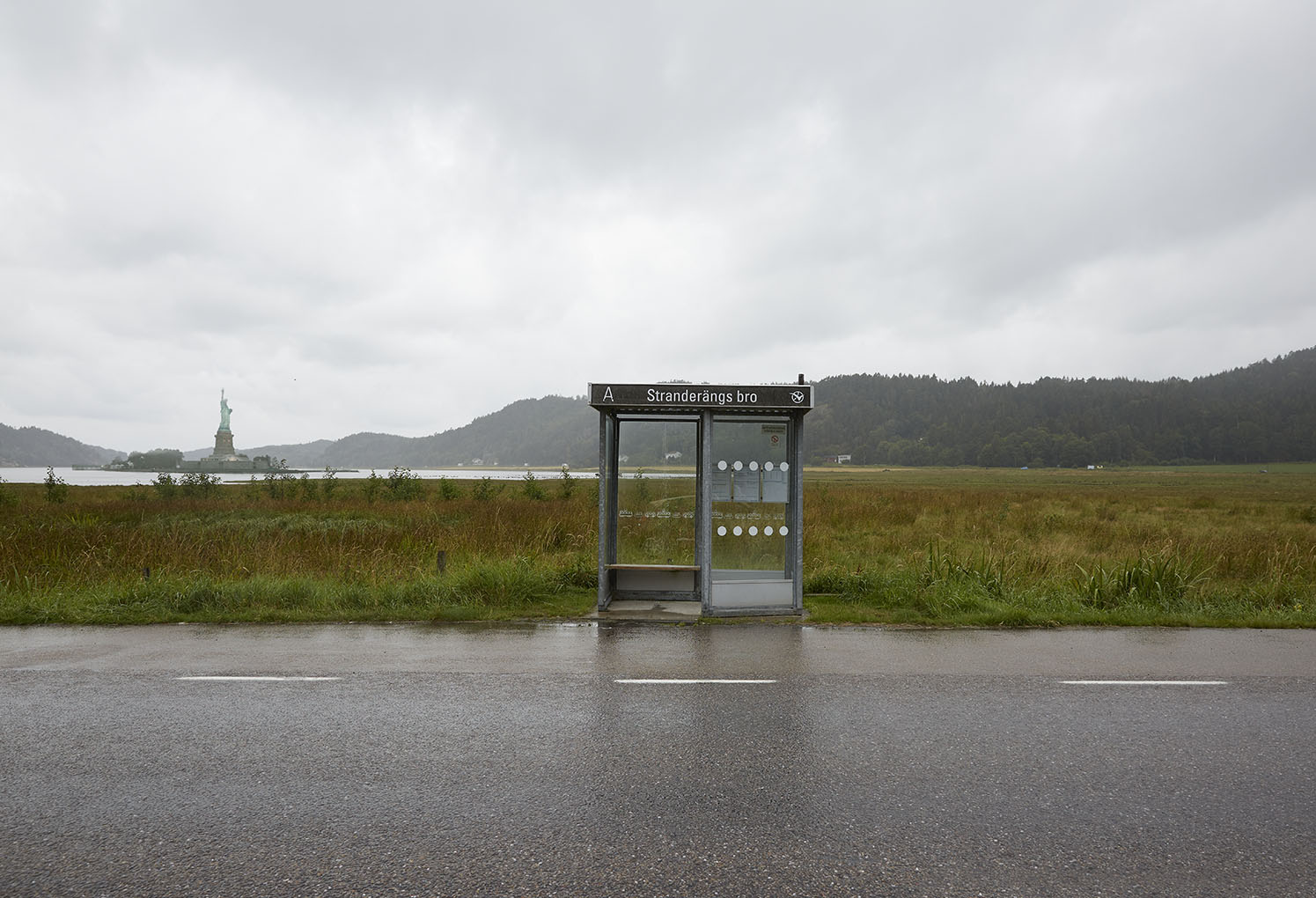
So the frame on this composition places Liberty Island into the background, the apparent object of interest the bus shelter.  Ive allowed the background to soften slightly, I want the viewer to come across the statue as a secondary thing, Ive moved the shelter slightly camera right , the eye should find the shelter straight away, the slope of the hillside leading the eye camera left to the island and statue.

An alternative version with different positioning and scaling of Liberty

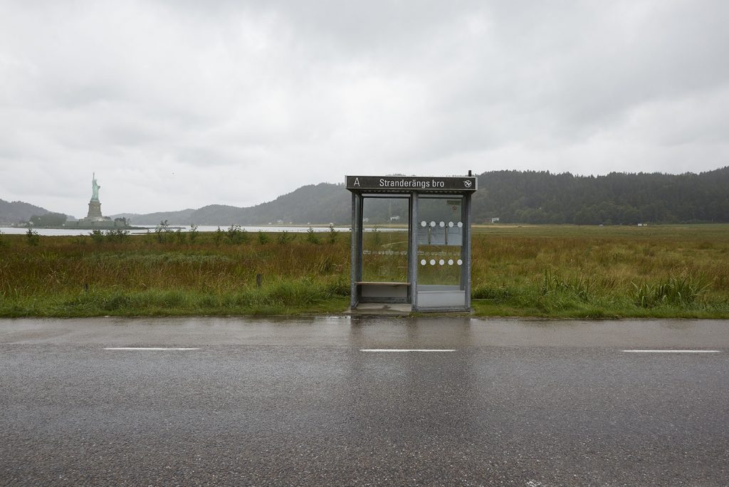
I like the subtlety of this, the dull day and grey sky increases the authenticity of the scene and I think it sits well with the other images in the In Between set.

Its also occurred to me that creating these images, particularly the third, hints at an alternative narrative that could have rolled out had events not proceeeded as planned, as they did.  What if the US didnt want the Statue Of Liberty? It was after all a gift from France.   What if the ships couldn’t sail, war struck before the statue was shipped and erected.  What if it had ended up somewhere in Europe, in a Swedish fjord maybe?  What would its cultural significance be without the association of immigration to the USA and renewed lives for which the statue has become synonymous?

It seems that to move the statue strips it of all cultural significance, I wonder how a real American patriot would view liberty in this fictitious situation?  Its still the same construction,  does its removal from the Hudson alter its perception?

From a practical and viewing perspective the size of final image display may benefit these executions by erring on the large format side of exhibition prints or book format if the theme does evolve to incorporate key elements as subtle background elements.   Saying that Its interesting to see that the shape of recognition value of Liberty remains undiminished at the small size published here.


PHO 702 Week 5 Activity: Of Mother Nature and Marlboro Men

Carl Lewis by Annie Liebovitz for Pirelli.jpg

This image of Carl Lewis by Annie Liebovitz  was shot for a Pirelli ad campaign conceived by London ad agency Young & Rubicon and aired in the 1990s.

I love this because not only is it brilliant advertising, it uses a strong visual and has a great line,  written by Ewan Paterson, that encapsulates everything you would want a tyre to do, ie give you control yet it also works as a gag at the expense of Lewis.

The ad relies on the on disrupting the gaze via the mechanism of the stiletto heels removing the ability of Carl Lewis to transmit his famed running power to the track to gain traction. Despite the shoes rendering Lewis’s power impotent he isnt a figure of ridicule, he’s still powerful in his stance and gaze to camera.  He could have been shown with a whimsical look but maintaining his ‘brand’ would be important to him and also important to the ad because its only the shoes (bad tyres) that are preventing his usual performance, even on the wet track.

Establishing whose gaze this image ‘should’ appeal to or be directed at is interesting, the shoes render Lewis as a figure of fun used in this context, in another context, say in an image being worn by a glamorous woman the shoes could be seen as sexy and decadent.  Here theyre hopelessly suited to the task.  The colour choice of red is interesting.

Red means different things to different cultures, in China it represents good luck and prosperity, in American culture, red often means sex & passion, along with red roses, red lipstick, red lingerie even the “red-light district.”

So if red is being associated with sex here then does Lewis look sexy?  Maybe, again it depends who is looking.  So this ad relies heavily on a gendered gaze but subverts it to highlight the proposition.


PHO 702 Week 5 Independent Reflection

“I suspect no landscape, vernacular or otherwise, can be comprehended unless we perceive it as an organization of space; unless we ask ourselves who owns or uses the spaces, how they were created and how they change.  J.B. Jackson


My practice I think revolves around the human condition.  This is a conclusion thats slowly dawning on me and becoming clearer.  I used to think I shot many different subjects which is true to an extent but looking at them with a more critical eye I can now see its the human element that is the consistent feature. Even in my landscape work there will be traces of human activity in one way or another.  Ive always been interested in the everyday and banal.

south beach pose-v2016.jpg
South Beach MIami. ©2018 Martin Brent

So I guess my gaze is directed at the world around me where humans inhabit or make their marks.  The image of the beach above I suppose could be considered voyeuristic, I take the privilege of the unseen observer, not unseen via use of long lens or digital technology, i’m using a standard lens and stood in plain site, but unseen to the subjects as they are very absorbed in their respective tasks. The ‘photo session’ continued for a good ten minutes, most people stood and chatted fo similar amounts of time.   From that perspective I am as much part of the scene. A photograph taken behind me of the same scene would include me as an equal part and participant and maybe such an image actually exists so given that I do not see this image as voyeuristic.

Roadside America 5.jpg
Amboy, CA ©2017 Martin Brent

Thus my view on the world is influenced by the changes humans have made to it, I rarely if ever photograph purely natural things.

My own ‘style’ or ‘look’ I would describe as  an observational one.  Im looking for themes, details, often making comments that I hope my audience will spot and investigate further. Equally I am content for the audience to enjoy the image purely on its aesthetic qualities.

For this reason I do use compositional rules to help the viewer find their way around the images. In many cases following my directions will lead to a questioning of what it is exactly the viewer is looking at and my theme or comment that may not have been immediately obvious to them might merge.

The above image is purposefully zoned, Ive chosen to cut the frame into horizontal stripes, I want the viewer to look at each stripe in turn to appreciate the sparse nature of the landscape and that the effect man has had is very localised and contained, transient even.  From the cactus concrete bordered shrubbery, the highway cutting through the desert, the minimal buildings and finally the telegraph poles crossing the vast nothingness vanishing into the mountains.

Ive given the image a big sky to reflect the wide open space and feeling of solitude, ive chosen to restrict the colour palette with desaturated areas and encouraged the natural yellow and red tinge of the cacti to come to the fore.

The new Topographics movement, a description coined by  William Jenkins, curator of a group show of contemporary American landscape photography held at George Eastman House in Rochester is very influential to my practice.

“Photographs of a Man-Altered Landscape” was how Jenkins had identified in the work of US photographers  Robert Adams, Lewis Baltz, Bernd and Hilla Becher (hurrah, a woman!), Joe Deal, Frank Gohlke, Nicholas Nixon, John Schott, Stephen Shore, and Henry Wessel, Jr. This is very much what i am also concerned with, the man altered landscape.

Sean O’Hagen in his piece in the Guardian, New Topographics: Photographs that find beauty in the banal observes

“Only one photographer, Shore, shot in colour. It seemed to heighten the sense of detachment in his photographs of anonymous intersections and streets. Shore was influenced by Ed Ruscha, the conceptualist of Californian cool, who, in the 60s, had made a series of artist’s books with self-explanatory titles such as Twentysix Gasoline Stations, Some Los Angeles Apartments, Every Building on the Sunset Strip. The show also nodded obliquely at the later work of Walker Evans, who had photographed the vernacular iconography of America in road signs, billboards, motels and shop fronts”

Main Street ©2017 Martin Brent

Although I also choose to photograph the vernacular and banal, I do not pursue my subjects in the same way as Ruscha shot his gas stations, he shot them as they were. A “they are what they are” approach. See my post last week about Ruscha.   I choose my subjects with a point in mind.  The image above, shot near Hisperia CA is the a gigantic recently cleared plot on the new edge of town.  Clearly Main Street isn’t what it was. Maybe this phase is transient but the collapse of small town America is no secret and I fear the lot will remain as it is.

Andy Grundberg has noted,

“For all its virtues in making us engage photographs more closely and complexly, the aesthetic of the equivalent…has one major shortcoming: after asserting that an apparently transparent image of the world is imbued with individual vision or feeling, it has difficulty defining what that vision or feeling is. Used as a critical instrument, the theory of equivalence is unable to determine any intended meaning in a photograph. But as a credo, it has served as the dominant aesthetic of American photographic modernist practice.”

As a photographer whose practice has evolved without the benefit of an arts based education or any real appreciation of the world of art photography until quite recently in real terms every discovery sheds new light on my practice and its incredibally exciting to discover what motivated Shore, Balts, Adams etc also motivated me before I was formally aware of their work beyond a superficial level and certainly their motivations for producing it.

To me it proves that the need to record, make sense of the world around us, the landscape according to your vision is an inbuilt trait, an obsession or need that we have to express.

Jenkins speaking of the photographers in New Topographics claims that although their photographs convey “substantial amounts of visual information,” they are, above all, aesthetic arrangements resisting interpretation.  He quotes Robert Adams:

“By Interstate 70: a dog skeleton, a vacuum cleaner, TV dinners, a doll, a pie, rolls of carpet…Later, next to the South Platte River: algae, broken concrete, jet contrails, the smell of crude oil…What I hope to document, though not at the expense of surface detail, is the Form that underlines this apparent chaos”.

Deborah Bright says “If we are to make photographs that raise questions or make statements about what is both in and around the picture, we must first become more conscious of the ideological assumptions that structure our approaches”.   This interests me and resonates, my first aim when embarking upon this MA was to understand my own practice and then be able to articulate that vision.  Also as part of my journey and evolving desire to create works for gallery display this next statement concerns me.

“As part of this, we need to examine the restrictive terms of the art museum and gallery nexus and ask ourselves whether we need to seek out other markets and audiences for our work”

This is something I never really considered, as I make my own art, playing by my rules and personal motivations will it ‘fit’ into the gallery nexus, will I need to discover my own outlet?

As Lewis Baltz says “The landscape…seems more a set of conditions, a location where things and events might transpire rather than a given thing or event in itself; an arena or circumstance within which an open set of possibilities might be induced to play themselves out”


References:

J.B. Jackson, “Concluding with Landscape,” Discovering the Vernacular Landscape (New Haven: Yale University Press, 1984), p. 150.

D Bright Of Mother Nature and Marlboro Men An Inquiry Into the Cultural Meanings of Landscape Photography

www.theguardian.com/artanddesign/2010/feb/08/new-topographics-photographs-american-landscapes

http://www.hyperallergic.com/417634/walker-evanss-eye-on-the-city/

Andy Grundberg, “Ansel Adams: the Politics of Natural Space,” The New Criterion (November 1984), p. 150.

Lewis Baltz, “Landscape Problems,” Aperture 98 (Spring 1985).

PHO 702 Week 4 – Independent Reflection

“When I first did the book on gasoline stations, people would look at it and say, “Are you kidding or what? Why are you doing this?” In a sense, that’s what I was after: I was after the head-scratching”. Ed Ruscha

The intent of my work is really does vary based on the topic or theme I’m engaged with at that time. Ive already spoken of the areas Ive work in greater detail in previous posts but essentially I’m concerned with shooting street portraiture, found landscape and also constructed tableau images.

My intent could be to simply make a humourous point, make social commentary about an issue that concerns me, make general photographic observations and record detail for posterity reasons and in the case of my constructed imagery gently deceive the viewer leading them possibly to a point, maybe social or political.

Strategies to achieve these aims will depend on the intended audience, in general when I’m shooting street work, looking for observational details, making commentary its very much with the photographic and photography viewing world in mind, via a photo book and increasingly online platforms like Instagram, which can be viewed here.

https://www.instagram.com/martinbrent/

Also but to a lesser extent professional platforms like linked In or Facebook business pages

https://uk.linkedin.com/in/martin-brent-6a44abb

https://m.facebook.com/martinbrentphotography/

Thus my image making assumes a level of interest and knowledge in advance, however as I’m also very interested in colour, many of my images are taken in places of general interest a more general audience should be able to find interest and one hopes this to be the case.

Defining success is a tricky one,  if you post an image on insta and end up with 150 likes is that successful? If the likes are from your target audience then maybe that denotes some form of success however maybe the likes are just polite likes or likes from a bot.  Maybe someone liked your image for a totally different reason than I intended.

If a project achieves widespread coverage and leads or help leads to a physically verifiable outcome then I think that can be definitely be described as successful, both personally and the for the cause it represents.

This work for Surfers Against Sewage started as a personal project after I observed discarded plastic bags in the ocean while Scuba Diving often formed a grotesque kind of mouth structure, having shot a few of these, further collaboration with art director and copywriting clients led to this campaign which was instrumental in the introduction if the 5p bag charge in the UK.

If the work ends up as being used as academic reference then I think that could also be considered successful but again in the context of the observations and conclusions drawn.  For instance if you end up with an unintended interpretation that you may feel is incorrect or misses the point that mail feel like a failure.

However I think its a mistake to attempt to measure ‘success’. If an image I create answers my personal brief then its ‘successful’ if an audience gets it that’s a bonus in my humble opinion.

Sometimes creating an image for no more than aesthetic reasons is reason enough to put it ‘out there’.  The ambiguity of purpose in this case leaving it open to interpretation, maybe the desire for the audience to make their own assumptions is an intent in itself.

Phillips 66, Flagstaff, AZ. Ed Ruscha 1962

Ed Ruschas when talking about his 26 Gas Stations project gas stations is a case in point, he says they are what they are but also-

“When I first did the book on gasoline stations, people would look at it and say, “Are you kidding or what? Why are you doing this?” In a sense, that’s what I was after: I was after the head-scratching.”

He goes on to say of his practice in general

“I just use [the camera]. I just pick it up like an axe when I’ve got to chop down a tree. I pick up a camera and go out and shoot the pictures I have to shoot”

I find myself in similar territory to Ruscha in his first point, I think I do like to provoke a little head scratching, do people see what you see, do they see something different, more?

I think Fred Ritchin sums it up neatly in a couple of short sentences

“Neither a person nor a photograph should be taken at face value; it is more complicated than that”.

Pho 702- Week 4- Into The Image World

Katherine Frith likens reading adverts to peeling an onion. She pinpoints three stages to reading adverts:

  1. The surface meaning
  2. The advertiser’s intended meaning and
  3. The cultural meaning.

She concludes that ‘advertising only “makes sense” when it resonates with certain deeply held belief systems’ (Frith: 2006: 5).


We were asked to choose and ad and consider the following.

  1. a dominant reading
  2. an oppositional reading and
  3. a negotiated reading.

Post your chosen adverts to this forum with a short statement outlining why you interpret them in this way. Comment on the contributions and interpretations of your peers, addressing the following points:

  • Do any common ‘belief systems’ emerge?
  • Do any interpretations ‘blend and clash’?

generic-page-71.jpg


The dominant theme in this ad is that the figure represents danger, the dark underpass, hooded youth with confrontational expression.

His posture appears to be challenging, threatening.  The urban built environment with shuttered business in the background, the fact theres no one else around and the youth appears to be showing a weapon, most likely a handgun.

Then on closer examination the dominant theme subsides to that of a negotiated theme as it becomes apparent the hand gun is in fact a battery power drill. The eye finds the copy to the left which is incongruous tucked into the bottom left, the copy tells you that the youths future isnt inevitably one of crime where it may well be headed now.

With some life chances through education or training the weapon becomes the tools for a new direction, a trade maybe.

The ad is for an organisation called Always A Chance after  James Cooper and James Kouzaris, two British tourists were tragically shot dead in Sarasota, Florida.  16 April 2011.  It transpired their killer could have been somewhere completely different had a training opportunity come to fruition so the parents of the boys set up the charity to encourage young people who are outside full time education and employment to re-engage with the education system or support them as they take their first steps into employment.

So I think this is a great example of an ad that uses a dominant reading that then subsides into a negotiated reading upon closer examination.

An oppositional reading could be the ad reinforces stereotypes and exploits common belief systems that inner city youths are criminals, armed and from ethnic minorities.

I would counter that the ad successfully subverts that belief system and uses it in a positive way to engage a viewer educating them in the process that their assumptions were incorrect and even if the youth was heading for criminality its not too late to prevent it.

This weeks submissions from everyone were really interesting and so were the interpretations of the how the ads should read.  This one in particular stood out to me and generated a very strong oppositional reading from myself..

Here is Clive Edwards post-

kendall-pepsi-vogue-5aprill17-.jpg

I’m not sure whether this image ever came out as an ad in its own right. Perhaps the video ad was pulled before the campaign got any commercial traction. The video ad for Pepsi achieved almost instant notoriety on its release in 2017. This is a still from the ad.

It features US mega celebrity Kendall Jenner. The narrative of the ad has her ‘gatecrashing’ a protest march. She throws off her blonde wig and joins the protestors as they march towards a line of armed police. Jenner, on reaching the police, pulls out a Pepsi and offers it to the stone-faced police officer, who accepts. Pepsi is therefore a symbol of harmony, unity and social cohesion.

That would have been the preferred reading of the Pepsi group and Creators League Studio who produced it. Jenner was chosen to front the ad because of her enormous appeal and influence as a fashion icon and social media celebrity.

There was an immediate backlash of oppositional readings, driven mainly by the #blacklivesmatter campaign, in which protestors were angered by police brutality particularly targeted at the black commmunity. Several memes and reconfigured versions of the original appeared on social media. Pepsi withdrew the ad very shortly after its release, following mounting criticism from the campaign.

This image below was tweeted with the caption: “Kendall, please give him a Pepsi”

C8muFxiXgAA0SrQ.jpg

Pepsi apologised to the campaigners,  saying that they had “clearly missed the mark. We did not intend to make light of any serious issue.” They also apologised to Kendall Jenner for putting her in that position (their words).

So there was a preferred meaning, an oppositional reading… is there a negotiated reading? I’m not sure. Does Pepsi’s withdrawal of the ad suggest that both sides accept the oppositional reading, and that universal acceptance of its wrongness is the negotiated one?

I wonder also whether the Pepsi ad was badly mistimed. At another time, when anti-police protests were not high on the news agenda… would the ad have been , if not acceptable, then at least less unacceptable.


My response as follows-

Martin Brent

The ad was monumental in its crass tone deafness,  no timing would have been good for this affront to advertising and morality, two words you’ll rarely see in the same sentence.

The image of Jenner handing the can to the police officer was a clearly ‘inspired’ by the image of  Ieshia Evans  offering her hands for arrest to a group of riot-gear-clad police officers at the Baton Rouge Black Lives Matter protest literally weeks if not days before.

It in turn, the action, not the image per se,  inspired by the iconic Bernie Boston shot of the young anti Vietnam war protester inserting a flower into the barrels of rifles pointed at the protestors  during the “March on The Pentagon”, 21 October 1967.

National Mall Protest, Flower Power, October 21, 1967. Photograph © Bernie Boston.

Any attempt to appropriate the iconic imagery of protest at any time is going to be controversial. Merely for an influencer to push a soft drink for a huge corporate? At at a time when people were literally being shot dead on what seemed like a weekly basis resulting in the BLM protests is so far beyond reproach its a wonder anyone could have looked at the script and said “yeah this is great.” The fact that Jenner was vacuous enough to do it, let alone her management allow her to does beg the question if those responsible are somehow wholly insulated from reality.

This really is an excellent example of when the cultural meaning of something is so huge, so ingrained it becomes untouchable unless the cause is perceived to be as laudable. Yet in this case apparently invisible to those responsible for producing the work.

So for me this can only be an oppositional reading.

Excellent post Clive.

References-

Clive Edwards Falmouth Uni

National Mall Protest, Flower Power, October 21, 1967. Photograph © Bernie Boston.

PHO 702 Week 4 Hunter or Farmer

“Wall divides photographers into two camps, hunters and farmers, the former tracking down and capturing images, the latter cultivating them over time.”

(Charlotte Cotton – the photograph as contemporary art)

In my practice I am both hunter and a farmer.  I shoot street imagery, looking for ‘real’ un manipulated ‘real’ moments. Equally i’ll also hunt out interesting scenes and locations then wait for something to happen. Then I am also very concerned with creating tablaeu landscape images which are entirely farmed being the compilation of image elements gathered often from completely different continents.

This image taken in New York is completely spontaneous,  I had no knowledge this man would be there, I didnt even know it was going to rain, so this image is absolutely from the hunter.  However I shot several frames, this is my favourite, it feels a little staged, theres a sense on the uncanny, the frame prior is this one,  the guy now looks to be more in conversation, less of a bystander to unknown events.

This next image was captured in Miami, its a mixture of the hunted and farmed as I had already seen the Lifeguard station, I knew i wanted to include it in a composition. The light was wrong at that point though so I returned the next day and also happened upon the metal detector guy.  I observed he was headed down the beach heading North so so I waited until I could juxtapose him with the hut, his red shirt complimenting the red stripes and cones,  this the scene is both curated (farmed) and hunted to my mind.

This final image is wholly farmed, the image elements were shot specifically and everything was composited in post production.  The mountains from Ludlow California, the gate I spotted in Javier, Valencia.  I knew as soon as I saw the gates that they would work with the mountains.  In this instance and for all of this project the results will be farmed but again an element of hunting will be needed as I search for elements to composite.

Shouldn’t a photograph be a document of things the photographer found in the world? Not according to Wall  “What an artist could do with photography wasn’t bounded by the documentary impulse — but that other part was underdeveloped,”  “Painting could be topographical realism or it could be angels — in the same medium. Why couldn’t photography do the same?”


References


Lubow A The Luminist Magazine   2007

Cotton C The photograph as contemporary art


PHO 702 Week 3- Independent Research.

“Photographys plausibility has always rested on the uniqueness of its indexical relation to the world it images, a relation that is regarded as fundamental to its operation as a system of representation. For this reason a photograph of something has long been held to be proof of that things being, even if not of its truth”

(Batchen, 2002, P.139)

Gregory Crewdson Untitled from Brief Encounters 2006

I have chosen three constructed images that particularly interest me.   All are fictional scenes, some based on a fictional event in a real world place, Crewdsons Brief Encounters image,  one wholly fictional being constructed from disparate elements, Marsoliers Playground 3 and one a little in between., Jeff Walls Sudden Gust Of Wind which is based on a woodcut by the Japanese artist Hokusai and uses real world and digitally manipulated objects to create the scene.

Crewdons and Walls work both use staged events to create a narrative. Crewdsosn use of the Motion Picture style lighting, the largely empty street except one solitary figure and the car tyre tracks combine to give a sense of the Uncanny.  Sigmund Freud in his theory specifically relates an aspect of the Uncanny derived from German the German adjective unheimlich with its base word heimlich  meaning “concealed, hidden, in secret”. He goes on to identify uncanny effects that result from instances of “repetition of the same thing,”  He includes incidents wherein one becomes lost and accidentally retraces one’s steps or instances where random numbers recur.

Crewdsons work successfully exploits the feelings generated by hinting of secret events, either just about to happen or the aftermath of, in this case the twilight, the movement of the car, the only thing moving, crossing the amber light gives the car purpose.  Where is it going, is it anything to do wit the lone figure? Is it leaving the scene of something out of frame. We will never know. Despite its motion picture qualities it is of course a still image and Crewdson says that, “My hope is my pictures, although elaborately staged, convey an experience that is intensely real. While my work process is similar to film production, the final result is quite different. Photography limits the narrative to be evoked through one solitary moment.”

He goes on to describe this process as “evoking” where the viewer is left to fill in the gaps, to evoke the narrative which may be influenced by events and experience that have nothing directly to do with the image.

This is very much the method I wish to employ in my own images, although my narative may not be as overt or theatrical as Crewdsons I till need the viewer to ‘evoke’ the circumstances of how my scene came to be or where it is.

Lauren Marsolier playground 3 2011

From this point of view my work is similar to Lauren Marsoliers.  In her Transition series she creates landscape and urbanscape that are wholly fictional, constructed from real world elements to create a whole ‘new’ and very convincing place.  Devoid of population there is a slight sense of uncanny but not in an ominous way. The images do not feel threatening, the lack of people doesnt seem to suggest a calamity, the images are clean, upbeat in some respects, it feels like a virgin environment on some levels but then there are signs that humans have been, maybe are there, some work in progress, a car under its cover tells the viewer people exist or existed.

While Lauren Marsolier’s work is photographic, her process is similar to painting.  “Months or years often separate the capture of elements juxtaposed in my landscapes,” she explains. “This approach reminds me of many painters who would make sketches at different locations to use as reference for their future paintings.”

Akin to the way a painter would use his sketchbook, Marsolier uses this library of farmed imagery to construct her tableau landscapes which is very much the method I am employing in my Inbetween Places project.

Where my project is different to Marsoliers is mine does not wish to divorce the captured elements from its original identity, moreover its essential that the places collected remain recognisable or capable of recognition given clues in the caption, maybe GPS or Google Earth co ordinates.  Marsolier’s work intentionally blurs the boundary between real and imagined.  This is  her intention: “I wanted the work to explore tensions between what feels familiar, natural, and what feels alien or fabricated”,

The artificial landscapes she constructs are designed to be confusing, by challenging the viewer’s notion of what is real, my manufactured landscapes also aim to confuse the viewer by moving recognisable places somewhere else.

Red Hut ©2018 Martin Brent Guest

Aesthetically my work is much closer to Marsoliers than Crewdson but the same theories are in play, a scene is created to allow invite the viewer to envoke the story. To imagine whats about to happen, why this classical Norwegian Fjord house appears to be built over a car park.  In this case what happened to the water?  My images (so far) also exist without people, I have contemplated including them but then I move to a slightly different potential reading where the viewer may start looking at the figures rather than the place.

My intention was to question peoples views of their identity based on the fixed geography of their nation state.  If people were included I think they would need to be dead pan but without the drama of Crewdsons iagery.

A Sudden Gust of Wind (after Hokusai) 1993 Jeff Wall

A Sudden Gust of Wind (after Hokusai) is based on a woodcut, Travellers Caught in a Sudden breeze at Ejiri(c.1832)  The Thirty-six Views of Fuji, by the Japanese painter and printmaker Katsushika Hokusai (1760-1849).

Wall photographed actors in a landscape located outside his home town, Vancouver, at times when similar weather conditions prevailed over a period of some months digitally compositing the elements.

As in Hokusai’s original, two men hold onto their hats while a third stares up into the sky, where his blows away.  Papers blow from a folder, trees bend in the strong wind also shedding their leaves.

katsushika Hokusai Travellers-caught in a sudden breeze at ejiri ca- 1832

The original woodcut shows a winding  path through some reeds leading towards Mount Fuji. Wall’s version is far more agri/industrial. Ploughed fields, telegraph poles and scarred landscape

There is no obvious reason for the characters to be there, why are they dressed in suits, what was their purpose, where is their car?   I assume they travelled from the city and not resident in this landscape. What is the purpose of the paperwork?

Whats going to happen next?  Assuming the papers are important but now lost..

I like the scaling of Walls work, he resists to fill the frame with the ‘action’ thus the people become part of the scene, very much like people depicted in a classical painting by Constable for instance. I like how he has stayed true to the woodcut yet still creates an image that stands in its own right.


References

Else Barents, Jeff Wall: Transparencies, Munich 1986

www.zoowithoutanimals.com/2014/01/28/a-sudden-gust-of-wind/

https://en.wikipedia.org/wiki/Uncanny#Related_theories

Batchen G, Each Wild IdeaWriting, Photography, History   MIT Press, 2002

www.ignant.com/2018/11/27/transition-to-a-fragmented-world-through-lauren-marsoliers-layered-photographs/

PHO 702 Week 3- Constructed Realties

All images can lie. they are all fictional.

There I said it, sweeping but true, unless the image is wholly objective, ie forensic photograph recording a crime scene for evidential purposes but even then it has to be trusted the content of the frame IS the scene and nothing has been manipulated.  So yes I see all images as being constructed and fabricated to one extent or another.

Lie is a big word so maybe thats a little harsh, maybe most photographs gently fib,  all those Christmas tree images on Instagram where the pile of decoration boxes and all the detritus that was where the tree stands now, out of frame. All those ‘chin up’ selfies..   everyone who ever took a photo curated the scene, usually to miss something less attractive out. Every family photo album was curated, the clothes with holes in, grubby faces excluded, the beach family group carefully arranged, everyone with a fixed smile waiting for the whir of the self timer to subside to a ‘click’ all for a tidier ‘truth’.

I think the important part is the intent of the lie, if its purely to make a ‘nicer’ picture, album etc so what, isnt that the photographers prerogative, to get the best image? However if the deception is to subvert opinion to nefarious ends then that is a different matter and often the context of the images use will determine the lie.

Here the notorious ‘Breaking Point’ ad commissioned by Nigel Farage subverted a news image of refugees travelling into Slovenia.  Getty Images confirmed that the picture had been licensed from them and was taken in Slovenia in 2015 by its staff photographer Jeff Mitchell. “It is always uncomfortable when an objective news photograph is used to deliver any political message or subjective agenda”

The image wasnt a lie, although the photographer did make a decision to use a long lens to compress the image which adds to the ‘mass’ of the group it was a true event however UKIPs use of the image was an outright fabrication even doubling down on the deception with when he said   “But, frankly, as you can see from this picture, most of the people coming are young males and, yes, they may be coming from countries that are not in a very happy state, they may be coming from places that are poorer than us, but the EU has made a fundamental error that risks the security of everybody.”

The image below the UKIP poster is Nazi propaganda.  Again using a photograph of a true event but appropriating it for their anti Jewish agenda with a false claim designed entirely to stoke hatred against the Jewish community who of course the Nazi had already decided would be persecuted horribly.

Crewdsons scenes are fictional, clearly, theyre lit to look theatrical, so hyper real if anything,  even if ‘nothing’ is happenig the scene is dramatised so its a dramatic nothing in essence. Theres a great deal of effort expended to create reality whilst simultaneously working hard to ensure the scenes are also ‘unreal’.

Staged work I enjoy, I like to look at the detail, artists like Crewdson, Jeff Wall etc are inviting the viewer in to do just that, to look closely, scrutinise the detail revelling in the artificiality which is of course what gives work like this its feel of the uncanny.

Twilight. Crewdon G Abrams 2002.
Twilight. Crewdson G Abrams 2002.

In my own practice as an advertising photographer I create images that lie, this time the aim is to convince the viewer to buy the product, listen to the messages to learn something, be aware of an issue. In this instance the images cannot be misleading because the ASA would ban them quite apart from the ethics however images are still constructed and staged.

Currys PC World Martin Brent 2015


This image for Currys PC world selling 4K TV. Clearly I didn’t go into space, the couple reflected in the visor also were not really reflected back at themselves from the image being broadcast from their new TV. It’s a complete fabrication but its meant in a humorous way to illustrate 4K TV is 4 times more detailed than standard HD.


Roactemra. Martin Brent 2015

This image for Roactemra, a treatment for Arthritis looks real enough but it is also a lie.

The father and son are both actors, the garden is rented, the wardrobe styled and supplied by a stylist, the goalpost chosen from half a dozen options.

To create the selfie style the image had to be shot in parts and comped together in post production, this arrangement, scaling and clarity throughout would not be possible to create in a single shot plus the ad agency needed to option to move elements about to suit different ad formats.

However the activity portrayed is exactly the kind of small gain a patient using this treatment would be able to achieve when it would have not been possible before. Medical advertising is strictly regulated so what was portrayed is clinically proven to be possible and all the images in the campaign were based on actual case studies.

So whilst the image is a fiction, the activity promised is achievable. A blurring of reality and fiction.

So far more subtle but every bit as staged as the Currys PC World ad but if this was a real selfie that would be a staged scene also surely?

So possibly as a result of spending my entire working life employed in the creation of staged imagery for advertising purposes I view all photographs as staged on one level or another if not as an outright lie as I opened this piece saying. I question all photographs, even photojournalistic enterprises on credible news sites etc, ie  Jeff Mitchells use of a telephoto lens in the Slovenia image.  I always expect that the realities surrounding the creation of any image, be it intentional, by circumstance or accident will affect the content of the image.

I have no problem with constructed realities or deceptions for entertainment or curatorial reasons, I know never to look at an ad and assume any aspect is real, it simply will not be the case. I know to question ‘news’ images because an agenda will always be in play and the photographers choices will decide what the image shows.  I know every image in a family album or on social media has been carefully curated.

I think Vicki Goldberg sums it up nicely in this statement

“Perhaps photographers who manufacture ambiguous facts and fictions disguised as truths have got it exactly right; perhaps they are telling it the way it really is. Maybe photographs are not lying even when they skitter along the thin edge between real life and theatre. Rather, they uncover the secret stories, mythic constructions and uncertainties that constitute our lives”.


References:

www.nytimes.com/1997/03/16/arts/photos-that-lie-and-tell-the-truth.html

Crewdson G Twilight Abrams. 2002

www.theguardian.com/politics/2016/jun/16/nigel-farage-defends-ukip-breaking-point-poster-queue-of-migrants

Jeff Mitchell/Getty Images


PHO 702 Week 2. Independent Reflection

“Is there anything peculiarly “photographic” about photography-something which sets it apart from all other ways of making pictures?”

The question posed by Snyder & Allen

The answer is yes, we should be mindful when viewing a photographic image not to take it at face value, to subject it to scrutiny, do not assume the photograph to be intrinsically honest despite age old pre-conceptions that photography is purely evidential, that the camera cannot lie.  It can and does, frequently.  Photography can be used evidentially of course but measures have to be taken that it is thus, that the image presented is a true and honest depiction of the scene photographed.

I found this week to be most interesting.  We covered the very themes that much of my practice, both commercial as an advertising photographer and personal rely upon.

The most challenging aspects I think are seeing how well, or not as the case may be,  established theory has aged given the rapid development of digital photography including CGI.  So whilst many of these theories are certainly still valid theres always a feeling of ‘ah but’ forming in my mind.

Fox Talbot that “By optical and chemical means alone [the image is] impressed by Nature’s hand”  well, maybe thats still true, even a digital image relies upon the action of light being refracted through a lens and exposing the light sensitive pixels on the chip. However a CGI image has no requirement for the action of light yet can create perfect photo realistic images so clearly technology has partially rendered Fox Talbots statement only half true.

Technology of course always moves on and its unfair to compare someones thoughts on a subject made 20, 50 or a hundred years ago or more and hold them against the technological and societal backdrop of the current day.  Whilst its true some factors can remain a constant, many can not.

Heres a short movie showing some of the latest moving image work utilising Unreal Engine software to create faces.  Very real looking faces.  This explosion in the advancement of image creation ability means we now have to consider images not only for their voracity as photographic objects but if theyre even photographic at all.


I agree with Ritchin when he said in 1999  “The questioning of the truth of all kinds of photographs is one of the welcome outcomes of the digital revolution. We are realising we are confusing an image with the reality to which it refers”

So essentially whilst the basic premise of these observations holds true they are all capable of contradiction and the relevance of the statement very much depends upon the iamge in question and the process, now more than ever, by which it came to be.

The means of delivery and the context in which images are viewed is clearly important. Given my own project aims to present a manufactured landscape intended to deceive the viewer into believing the places are real then I have come to realise that the presentation of the images is an important factor.

If the images are viewed in a formal gallery setting or in a photo book is this enough in itself to secure the ‘reality’ of the places depicted in the viewers mind if for instance the show or book was described as contemporary landscape and staged in a gallery of standing and a book given an authoritative academic foreword etc etc?

Orange Gate. The In between Places ©2018 martin Brent

What if this image was re-captioned  ‘Ludlow California,  Bullion Mountains Access Gate’   given the current nationalistic tone to the news and society would many people question these mountains were now ‘gated’?


References:

Barthes, R. (1980). Camera Lucida: Hill & Wang
Szarkowski, J. (1966) To The Photographers Eye. New York: The Museum of Modern Art.
Berger, J. (2013). Understanding a Photograph. Aperture.
Snyder, J. Walsh, A. (1975) Photography, Vision, and Representation. Critical Inquiry.

www.youtube.com/watch?v=C–mu07uhQw


PHO 702 Week 2- Is It Really Real?

What is real?  When you look at an image, digitally on screen or physically as a photograph it already isnt the real subject. Its a representation of that subject so the image is already a step away from reality.  Putting this aside and concentrating purely on the content of the image,  is what you’re seeing the reality of the situation depicted, an edited sample of a wider scene, a manipulated image or wholly synthetic as in the case of CGI?

Even a straight image shot on film and contact printed will only be a representation of the scene as the photographer made choices at the capture stage, chose a film stock and the chemical process also introduced variables,  Gary Winogrand said  “I photograph to see what the world looks like photographed”  so for this reason I do strongly believe an apparently photographic image does demand more careful evaluation than a water colour for instance.

When viewing a drawing or painting it is already assumed and accepted artistic licence exists, what we’re seeing isnt a literal ‘copy’ of the subject at that time, indeed the scene may exist in no other place than the artists imagination.  The same can be said of CGI imagery,  although generally speaking it is photo realistic (theres an irony in here somewhere) the image is purely data, literally 1’s and 0’s. no more.  We view it as a photograph and make judgements based on our experience of reality and also sub consciously how an image is “supposed’ to look in a photograph even though it may not be ‘technically’ correct,

When viewing actual photographic images we apply the same filters, primarily unconsciously using our knowledge of reality, our gut feeling and also as practitioners of photography our expert eye to test the voracity of what we see.    Arnheim bases his argument on the “mechanical” origin of photographic images  “All I have said derives ultimately from the fundamental peculiarity of the photographic medium: the physical objects themselves print their image by means of the optical and chemical action of light”

Curiously the more mundane and seemingly everyday an image the less scrutiny it is likely to garner whereas an image of an unusual event or something out of the ordinary, ie the photographs of the Jets hitting the Twin Towers on 9/11 received extraordinary scrutiny yet were essentially everyday snapshots taken from street level as the same views had been taken a million times before.  The unique and terrifying events recorded in this instance seemed to demand a higher level of proberty than had the snapshot simply been of the twin towers on any other day prior to the attack.

Again Arnheim says   “Because of this fundamental peculiarity, photographs have an authenticity from which painting is barred by birth”    In looking at photographs, “we are on vacation from artifice. We expect to find a certain “documentary value in photographs, and toward this end we ask certain documentary questions”

“Is it authentic? Is it correct? and Is true?”

I think these are valid and important questions.  When we see images published should we assume they are true depictions? I believe we should not.

This image was supplied to a number of retouchers across the globe who were asked to retouch the image to suit their regional expectation for body shape, skin tone etc etc. The image below is the model as shot, no retouching has been done.

The images below are the variations produced.  Same girl, same source image. Clearly not only ha the body shape been radcally altered, weight has been added or reduced, the BMI on the thinnest was around 17, literally a starvation level.  The hair again has been altered.  Looking at the side by side the differences are obvious.  Displayed individually in the context of a social media roll theres no way of knowing theyre utterly fake.


Looking at popular culture there is a great deal of emphasis on self/body image, never before have so many individuals felt the need or had the ability to display photographic depictions of themselves for strangers consumption. This obviously is aided by the simple process of being able to publish a digital image from a smart phone and the social expectations that have grown out of image sharing platforms like Instagram.  However when viewing these images it is important that critical standards are applied and I feel it is now more important than ever that the young in society are equipped with the tools if not to readily spot a fake, certainly to question an images authenticity as a default position which brings us full circle from Fox Talbots declaration  that  “By optical and chemical means alone the image is impressed by Nature’s hand”.


References:


Photography, Vision & Representation.  Snyder & Allen (1975

https://petapixel.com/2015/08/15/one-woman-photoshopped-by-18-countries-beauty-standards-revealed/