Although it took until March this year for me to finally understand what my project was about and where it lives contextually in the world of photography, given it had moved subtly as it evolved. I find I am now able to evolve the images further and refine them in ways I just couldnt achieve prior.
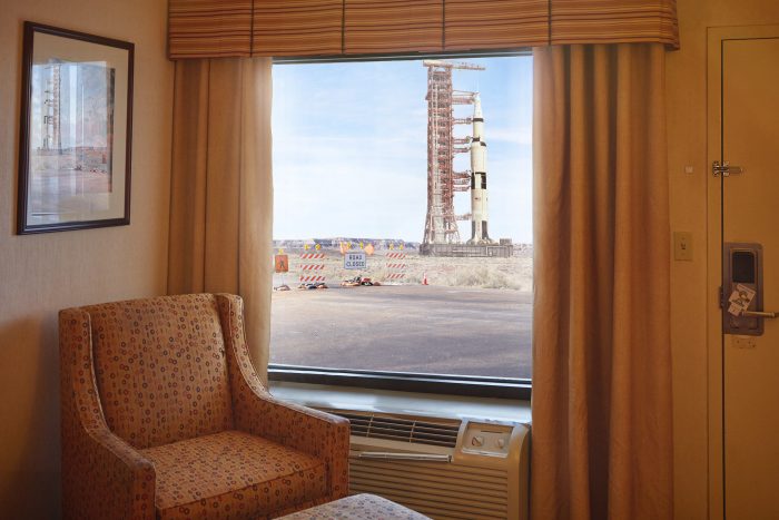
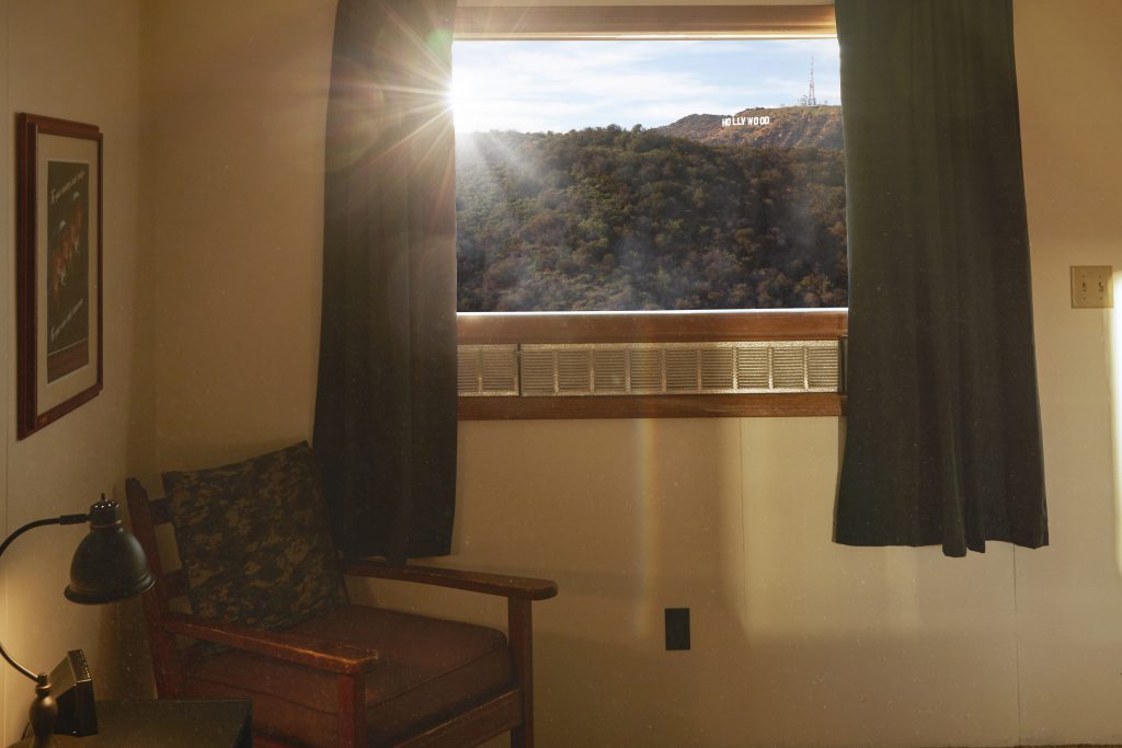
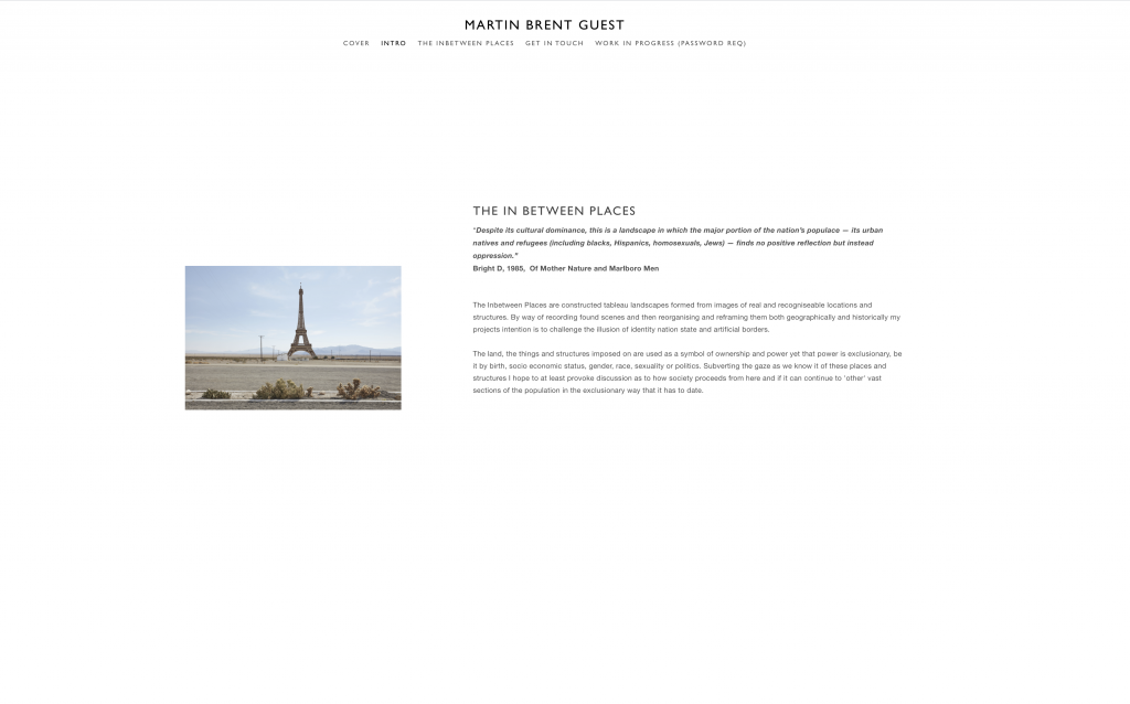
I now have no fear of making beautiful images in response to what are in reality quite ugly human attributes, learning of the Pittura Metafisica where the artists response to the carnage of WW1 amongst other tumultuous events and first adopted by Chirico and Carra in 1917, actually while convalescing at a military hospital having both succumbed to nervous breakdowns. The main characteristics include the use of images designed to convey a sense of mystery, enigmatic, and dreamlike. Typically marked by unreal lighting, impossible linear perspective however most compositions maintain actual structure and convey a sense of timelessness and stillness.
Shuttle
Derived from Renaissance art traditions of the early 16th century. The style also borrowed heavily from the European Symbolism movement. In turn, it had a significant impact on Surrealism, in particular on the classical work of Salvador Dali (1904-89)
Hollywood 2020
So whilst previously I felt sunshine may not have had any place now it feels appropriate although the deep shadows I do enjoy, adding a little mystery in the true sense and faithful to pittura metafisica. I also feel free now to explore my alternate chronology strand into the main body of the work in a way that no longer feels at odds or possibly gimmicky.
References:
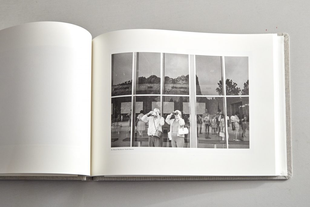
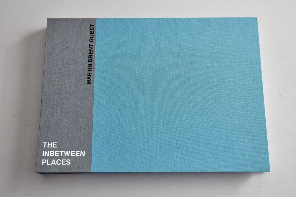
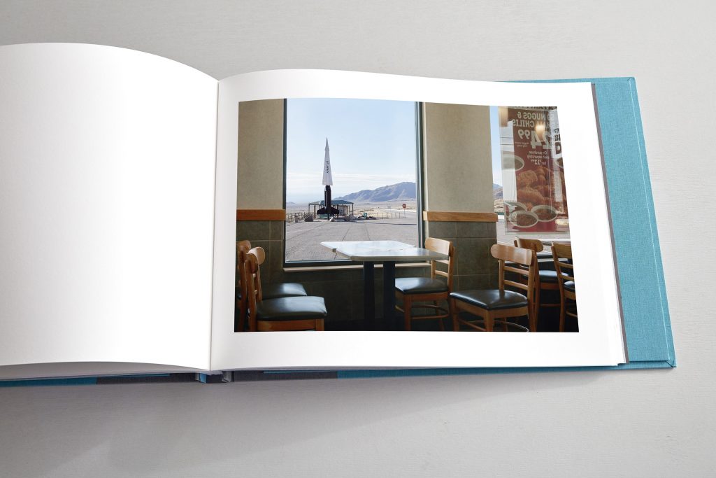
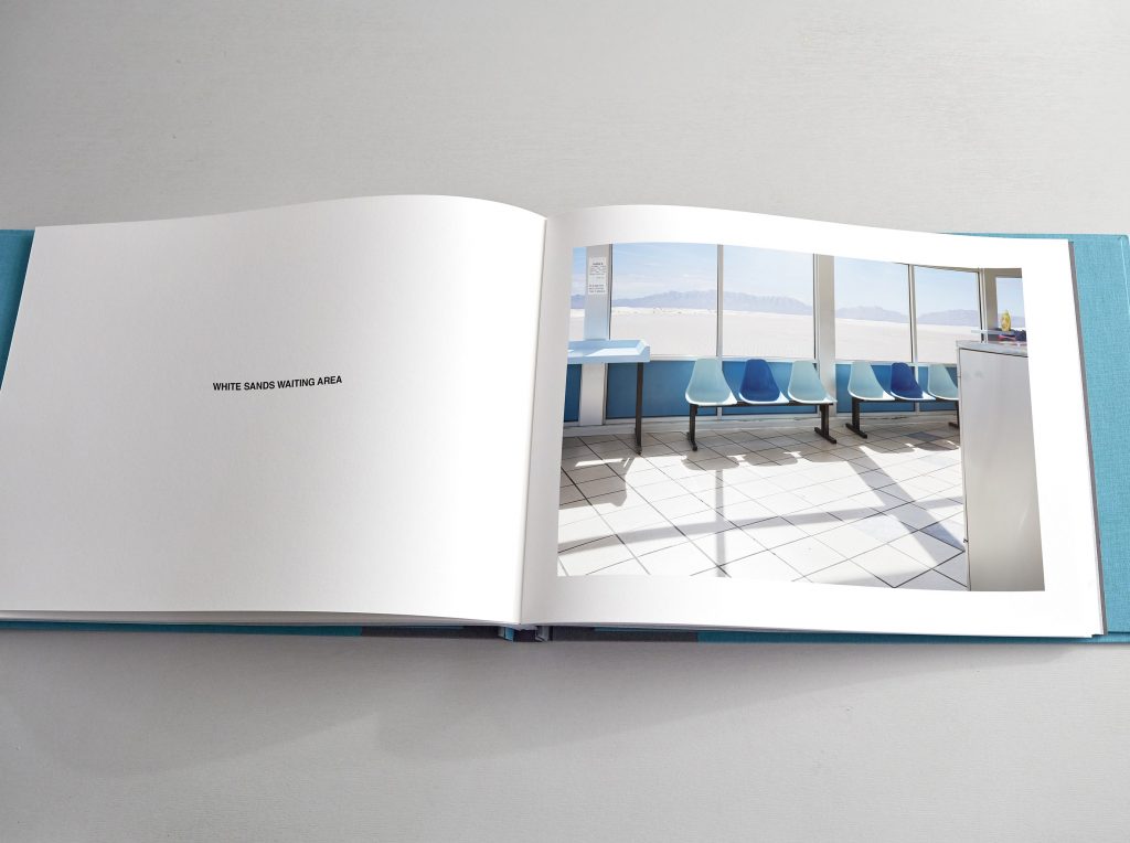
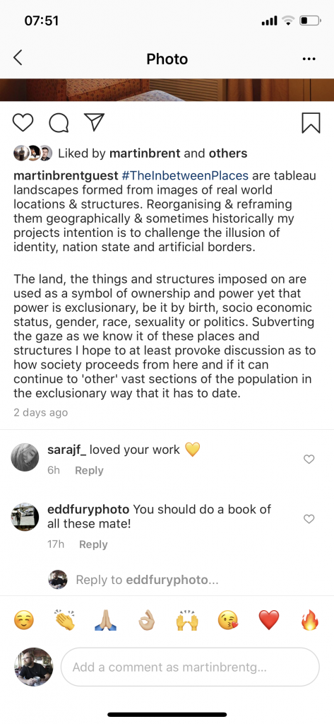
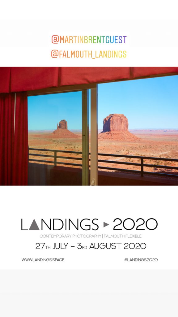
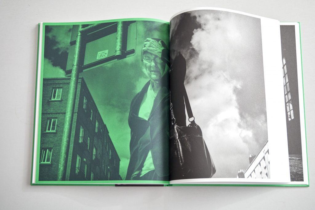
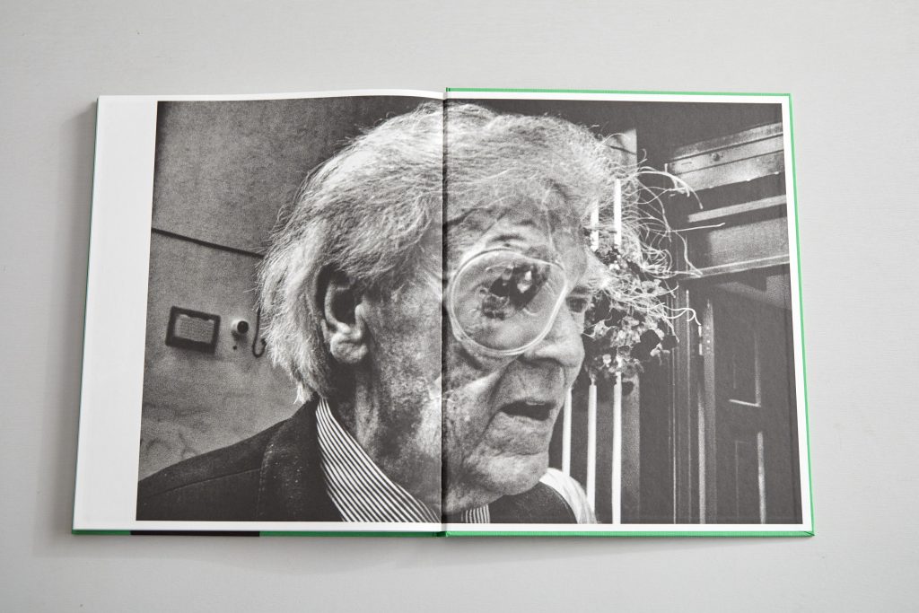
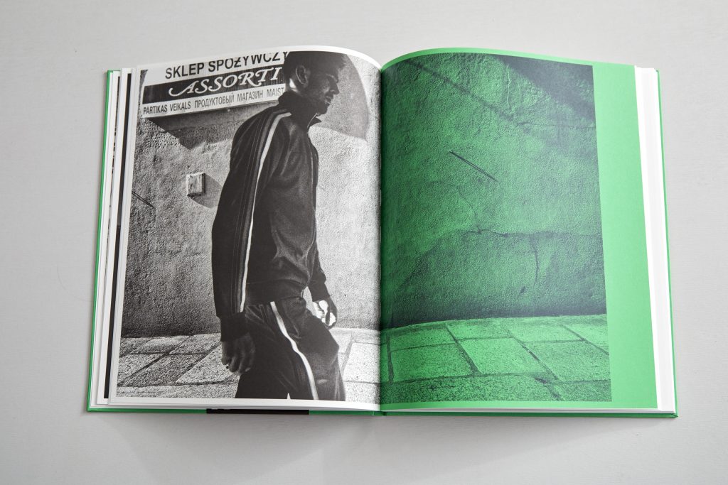
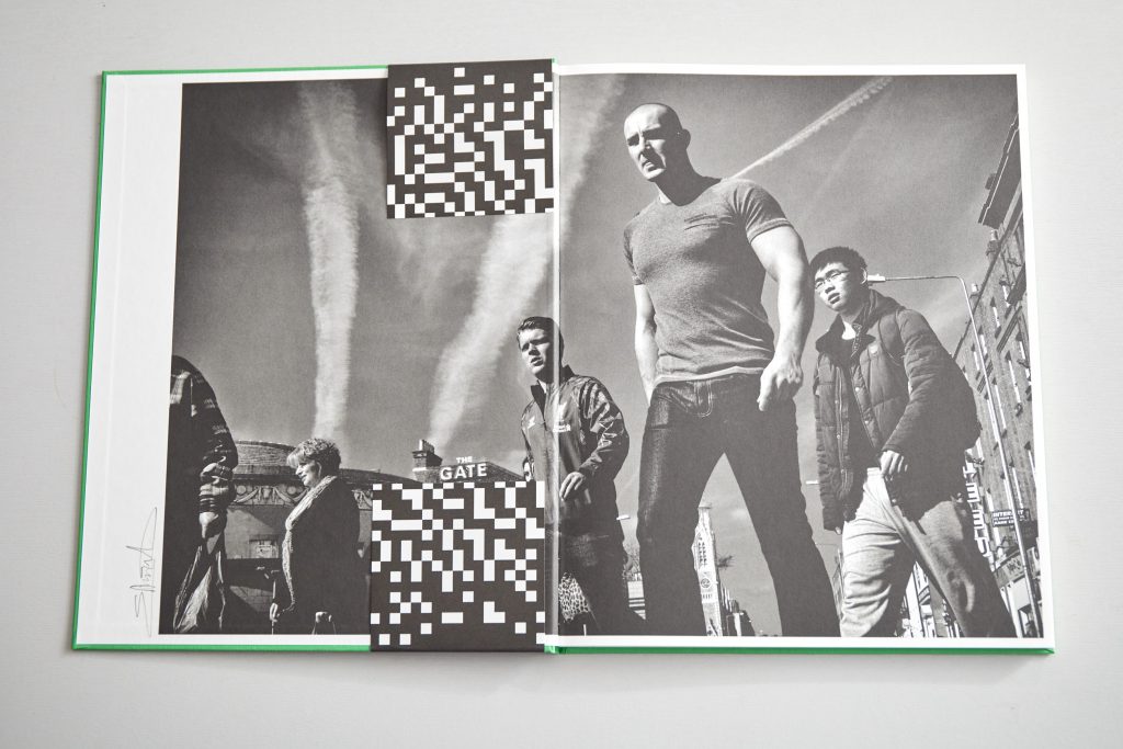
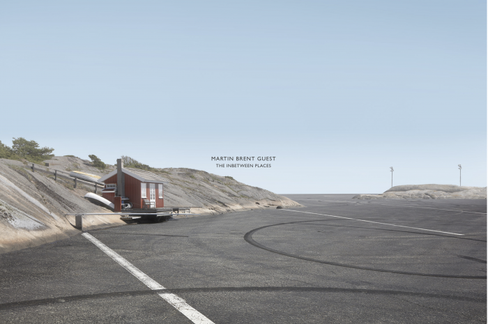
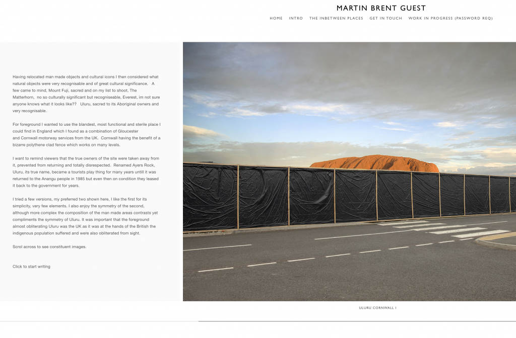
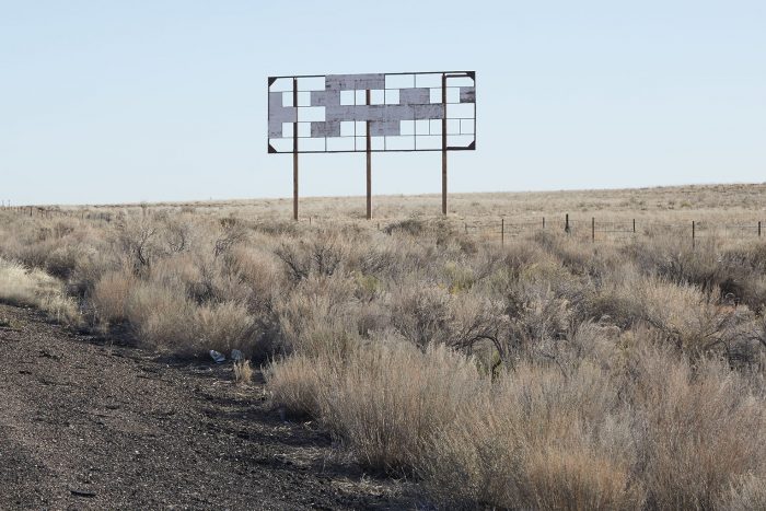
All images Brent Guest M, 2020, The Inbetween Places
by brentpix
|
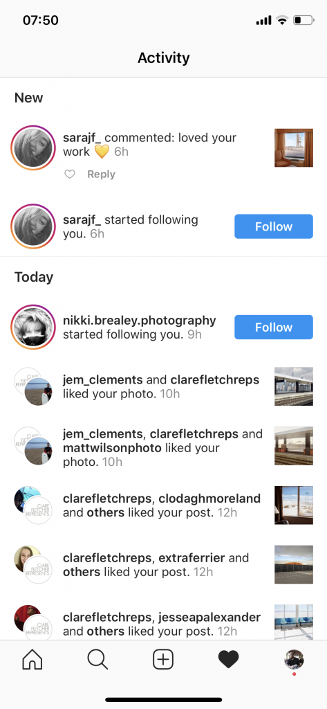
Comments Off on Public Outcome- Print Book
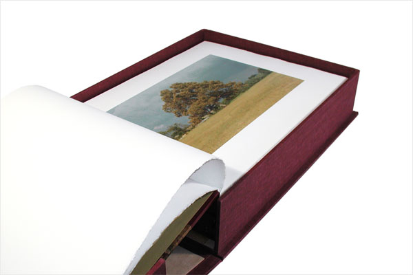
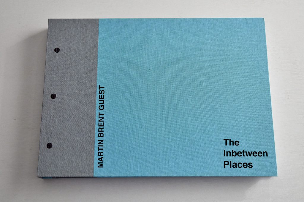
One element of the ultimate public outcome will be a book of the final works. So having researched a lot of photo books I settled on (imho) a very interesting and high quality route to produce the first run of The Inbetween Places book which will be an edition of 5. A folio book I fee is important because taking a folio out is a well established and effective way of showing works, it would also be available to purchase but limited to a run of five only.
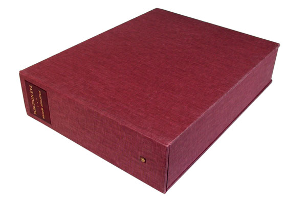
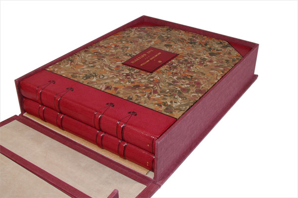
Heavily influenced by William Egglestons approach to Election Eve which comprised of two album bound editions of 50 actual prints each contained in a clamshell linen box, It was published by Caldecot Chubb in New York and has since become Eggleston’s rarest collectible book.
Also Lee Friedlanders Leslie George Katz, designed American Monument which echoed Katz ‘Eakins Pocket Albums’. Each contain- ing 16 photogravure prints held in place by album style posts enabling the dismantling of the images from the cover for temporary display purposes. In some respects echoing sales ledgers of the Victorian era the American Monument also follows that mechanism with three posts protruding unapologetically through the front cover holding the removable pages in place.
Friedlander L, 1976, The American Monument Friedlander L, 1976, The American Monument
A very expensive route, each costing in excess of £400 each to produce including the prints, it answered all my concerns about size and quality of the print but negates creating a large run of lithographic books which would be extremely expensive in itself. I absolutely love the idea of the prints being removable to display or frame which I know also excited Friedlander.
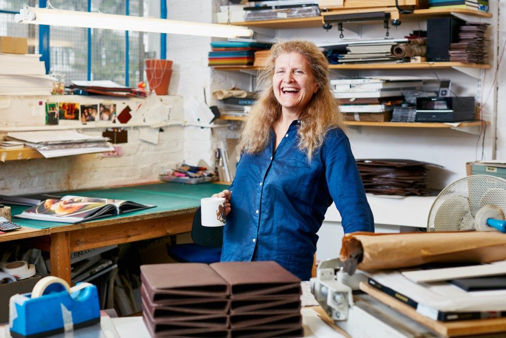
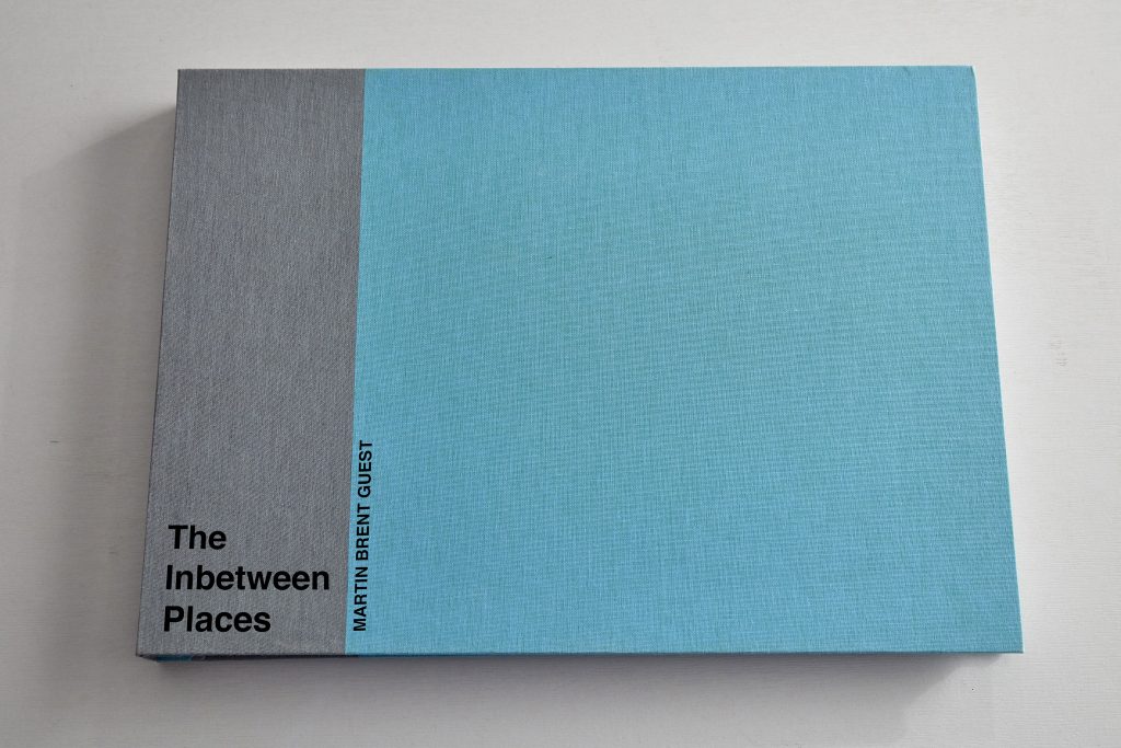
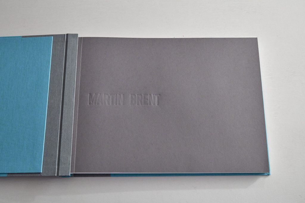
Collaborating with Cathy Robert of Delta design the book design is still in progress but I have included mock up images which address the key elements of construction, presentation of the images, captioning etc.
Terry J, 2019 Cathy Robert at Delta Design Studio, London
The cover materials are to be decided but Cathy has sourced a faux reptile skin which I agree echoes the desert environment represented in many of the images is the most likely choice going forwards. Its quite a lurid green but I think it will work really well adding not only a unique visual appeal but also a tactile one too.
The Inbetween Places cover mock up options, the posts may protrude through the cover or be concealed depending on final typography design.
Cover samples.
The page material will most likely be Hahnemuhle photorag duo which as well as providing a museum grade smooth, high quality and white surface also allows the caption to be printed on the verso. The total print count is expected to be 25-30 pages
by brentpix
|
Comments Off on Public Outcome: Landings 2020
So although it was a real struggle to get enough imagery together and the website finished off I was very pleased to be able to join in with the end of year show. It was very well attended with I believe 63 students in total taking part from the MA and BA top up cohorts.
The organisers made a really good job of it, particularly on the social media front which was essential given the current problems with Covid. My insta feed was permanently full with Landings related content to look at and share, it was a very interactive experience and it generated a lot of interest.
The theme for the show was Metamorphosis which couldnt really have been much better for me and my FMP given that its all about morphing and reshaping the landscape. here was a movie and downloadable brochure and online brochure too. The space was given very democratically and I congratulate the Landings committee on a job well done!
Feedback has been immense and extremely positive, I actually got very nervous about showing the project for the first time, especially as its not complete yet. As an advertising photographer you get to hide behind other peoples ideas, with this one theres no hiding place!
Heres a little of the feedback received.
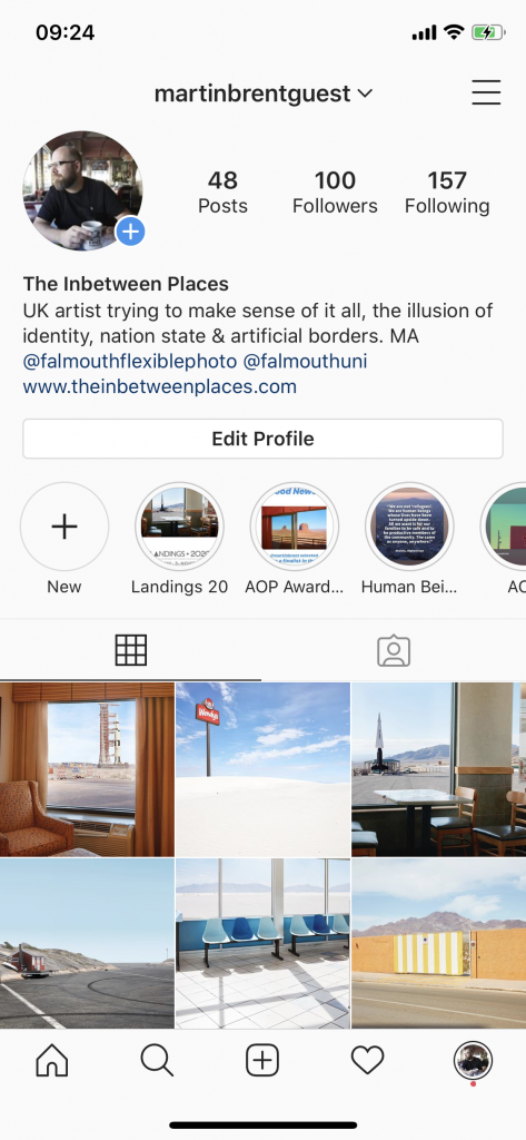
And heres a link to the project site www.theinbtweenplaces.com and below one of the Landings Instagram posts.
by brentpix
|
Comments Off on Public Outcome- Installation/Exhibition
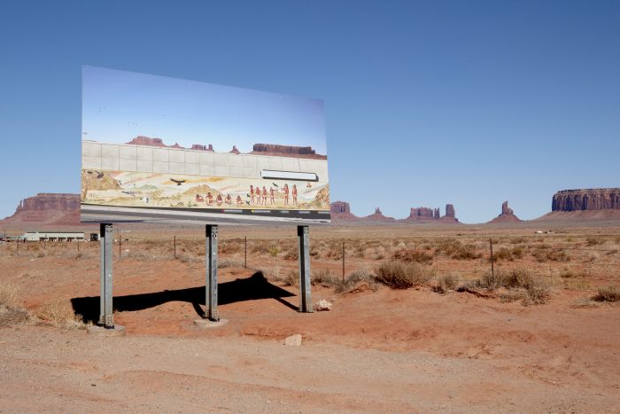
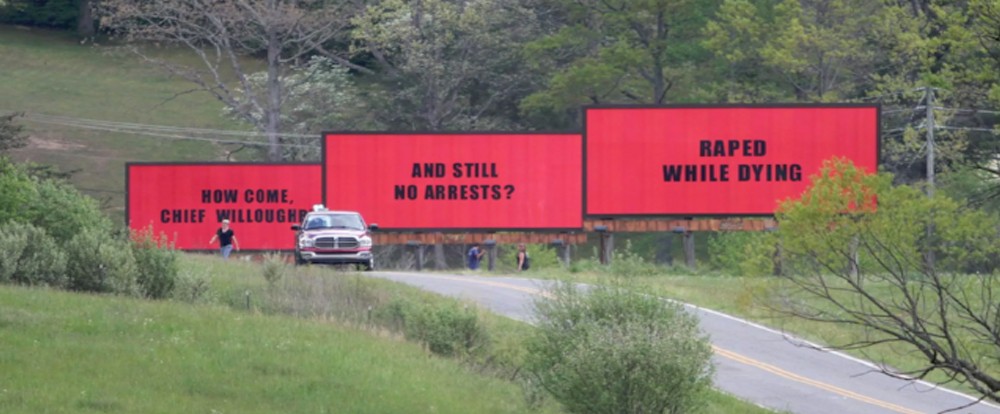
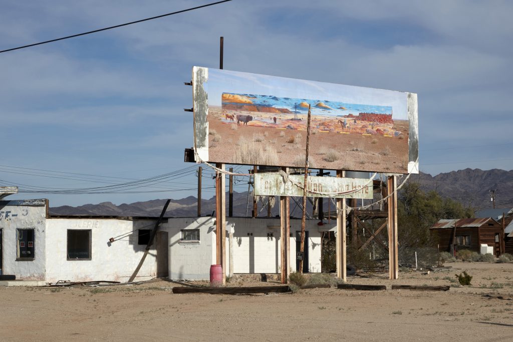
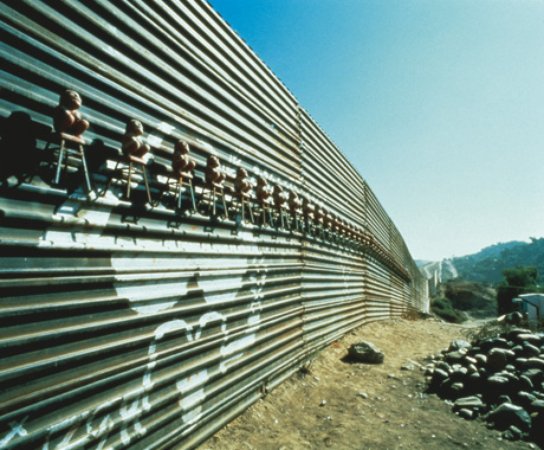
A definite plan for the future showing of work Inspired by the 2017 Martin McDonagh movie Three Billboards Outside Ebbing Missouri and artist Corrine Silver I really would like to display some of my images at the locations they were made. Small town America is punctuated from the surrounding open space by series of bill- boards once advertising local stores etc on the main routes in but now largely abandoned.
In the movie a grieving mother is angry over the lack of
progress in the investigation into her daughters murder and rents three
abandoned billboards near her home and posts on them: “Raped While
Dying”, “And Still No Arrests?”, and “How Come, Chief
Willoughby?”
McDonagh M, 2017, Three Billboards Outside Ebbing, Missouri
Corinne Silva made a series of landscape photographs then creating an intervention in the Spanish landscape by installing three of these images on 8 by 3 metre billboards in specific locations in the region of Murcia and then rephotographing them to form her actual show.
Silva C, 2010, Imported Landscapes 1
Ive mocked up four genuine poster sites with images made in their locale, the small town sites are available very cheaply, literally tens of dollars, the hard part is finding the local agent, the city signs are extremely expensive and only viable as part of a mainstream consumer media plan with budget to match so LA may have to wait a while!
Brent Guest M’ 2020 The Inbetween Billboards CortezBrent Guest M’ 2020 The Inbetween Billboards UtahBrent Guest M’ 2020 The Inbetween Billboards LABrent Guest M’ 2020 The Inbetween Billboards Route 66
This of course is not a new idea, inSite running in 1992, 1994, 1997, 2000–1, and 2005 ran at various sites in Tijuana, Mexico and San Diego, California
inSite
Originally founded to address a perceived lack of cultural institutions in San Diego, with its second iteration in 1994, “inSITE” expanded to locations spanning the area immediately around the U.S.-Mexico border with artists including Gary Simmons, Lorna Simpson, and Nari Ward, Curated by Jessica Bradley, Olivier Debroise, Ivo Mesquita and Sally Yard placed images and installations into the environments they aimed to confront.
by brentpix
|
Comments Off on More book research Japanscapes & Eamonn Doyle
Looking at other landscape practitioners I recalled a book I picked up at Paris Foto 2019 at the Polka Gallery.
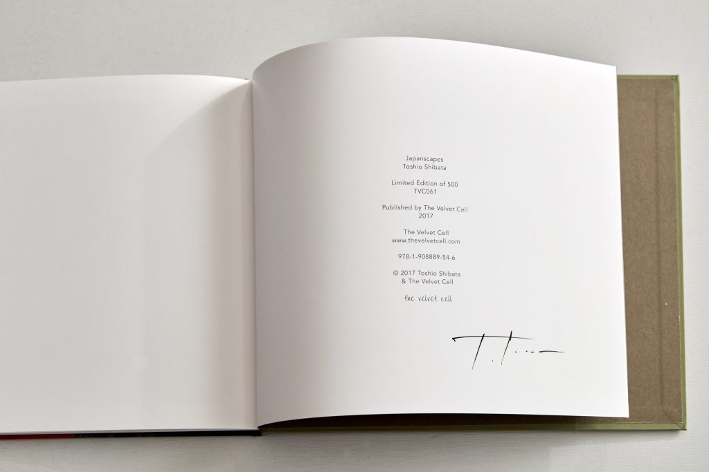
Japanscapes, Toshio Shibata, The Velvet Cell, 2017
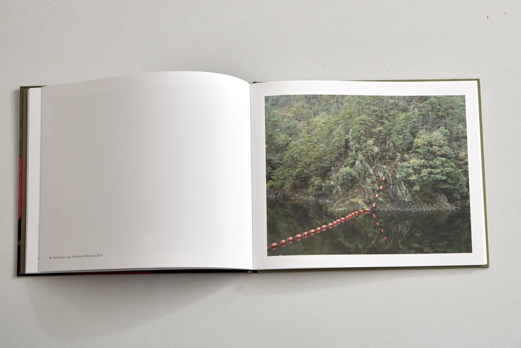
Japanscapes by Toshio Shibata. His images are wonderfully detailed but always very calm, creating simple shapes from what could be quite busy scenes Shibatas images are always harmonious both in colour and composition and I think thats allowed him to risk a smaller print size, indeed at the Polka Gallery they were offering 5×4″ contact prints of his work proving the images can be viewed at quite small size yet still be enjoyable to view.
It helps Shibata retains the original image ratio from the 5×4 negative so in essence is only a little wider then Egglestons 2 1/4 yet this book is a lot smaller in height. I think its the nature of the images that allows them to be viewed successfully at a smaller size. The book in itself is good, not stand out but its very simple, the cover is printed and has a matt varnish which feels nice and theres no dust jacket. . The take away from this is if the images are strong, yet simple they can be viewed at a smaller size and still be appreciated.
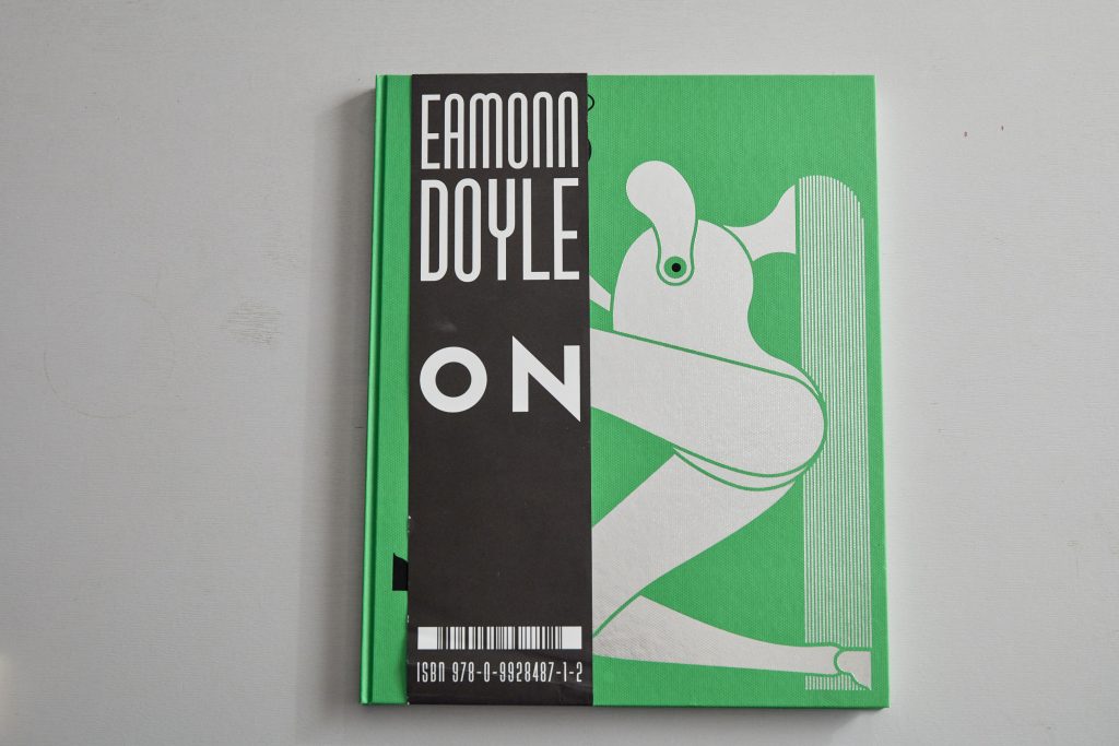
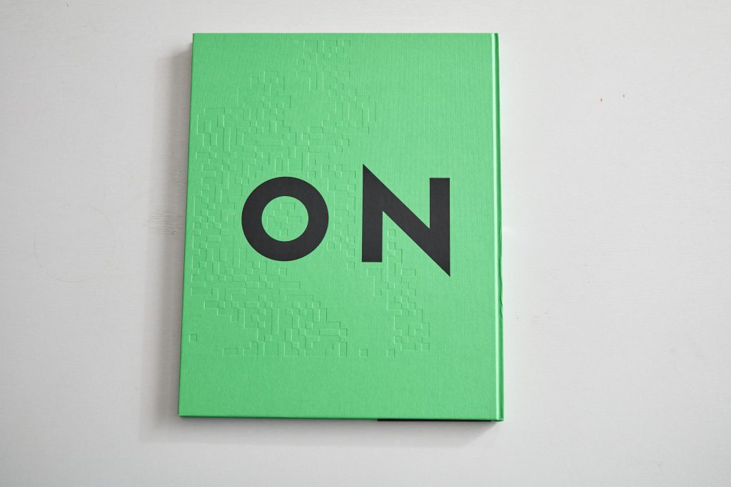
So does a book of landscape format images have to be landscape format and thus pretty huge. Not according to Eamonn Doyle. His books, actually better described as happenings in their own right in some cases, has no problem splitting his image across the gutter and infact uses his composition to enhance and draw attention to the separation in his book ON.
Eamonn Doyle, ON, Design Pony Ltd 2015
He also uses duo tones to further split some of the images, theres no attempt here to disguise that gutter and it works really well. I suspect the very dark tones and dense shadow area helps in this process, I absolutely love the bold approach and innovative way this portrait format book delivers landscape images.
So lots to take home from looking at these books but not a complete solution to my list of requirements and all, except Japanscapes, are very expensive productions which my students budget could never match.
References:
Shibata T, 2017, Japanscapes, The Velvet Cell 1st ed 500
by brentpix
|
Comments Off on Jenny Odell- Travel By Approximation
I was particularly excited to discover this work by Jenny Odell. Given the physical restrictions imposed by my illness and then Covid as Ive already documented I was in danger of not being able to gather my source images as i’d intended.
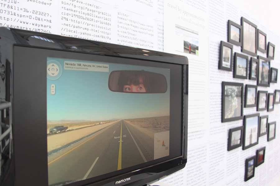
Odell in her Travel By Approximation virtual road trip, Crossing borders without even going there, the artist embarks on a wholly virtual road trip using Street View and then digitally incorporating herself into he landscapes. She does this very well, although this probably wouldnt be a total answer to the inability to gather images in person its a very interesting approach and one of the most interesting forms of image appropriation I’ve seen .
Odell explains “Travel by Approximation is the record of a trip I made across the United States by way of the internet. It began as something loosely based on a real trip I had wanted to take but never had, but soon took its own, much more reckless form. In order to travel, I made use of any sources of information I could find online, relying especially on Google Street View, photo databases (Panoramio, Picasa, Flickr), review sites (Yelp, TripAdvisor, CitySearch, Insider Pages), and virtual tours of monuments, restaurants, hotels, etc. For one real year—almost two virtual months—I transported myself into one place after another, both by writing a travel narrative and by using Photoshop to integrate myself into photos I found online“.
Travel by Approximation: A Virtual Road Trip 2010. Jenny Odell
The project also included ‘The Ministry of Approximate Travel’ a virtual travel agency in which Odell had conversations with visitors about her virtual memories of places as compared with their real ones. The Ministry of Approximate Travel has appeared at the SFAI graduating MFA show, Root Division, and the California Academy of Sciences’ Night Life.
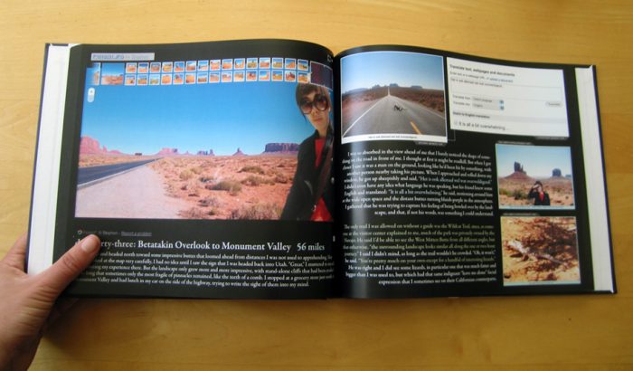
The installation featured a video version of the day from the trip in which Odell visited Las Vegas, including all of the shots from that day along with her voice reading the text over them, as well as having various YouTube videos of people walking down the street and through hotels, etc. spliced in.Pages 97-98, The Grand Canyon. The artist encountering a guy who claims (on TripAdvisor) that “the thing with the Grand Canyon is… once you’ve seen it, well, you’ve seen it.” (Those are his bored kids in the photos.) On the next page are user photos all geotagged at the same exact spot on Google Maps, a lookout point just off the main road.
Odell describes her methodology, its actually very similar to mins in many respects.
“I set several parameters for this trip in order to preserve a sense of spatial wandering as well as the integrity of my source information: 1. I had to find things by wandering on Google Maps before researching them further on other sites (as opposed to looking up a list of attractions for a given city, then traveling to one of those destinations). 2. I could not digitally alter the photos I put myself into; I could only alter the photo of myself to match the source photo. 3. Each day of the trip was physically feasible, in terms of gas, food, safety, and a place to stay, as well as the number of miles or hours driven. 4. Every piece of information (photos, videos, articles, websites, online books) would be cited at the end of this book”.
I absolutely love this project, Odell demonstrates its perfectly possible to travel without leaving the PC, even creating memories and providing virtual anecdotes base on genuine experiences harvested from the web.
References:
Travel by Approximation: A Virtual Road Trip 2010. Jenny Odell
by brentpix
|
Comments Off on Public Outcome- Website
The website was initially constructed as a work in progress vehicle but having a project title in mind early on I elected to give it a unique URL rather than being a bolt on to my commercial site.
Homepage
Intro page with main menu options
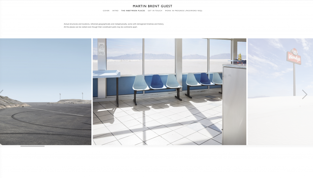
Ive provided short project description on the intro page and then a further sub description once into the main gallery area. This catches the impatient who may click straight through. The images present in a rolling gallery visible at a good size within the gallery reel but also allows a full page enlargement with a click on.
Main Gallery reel
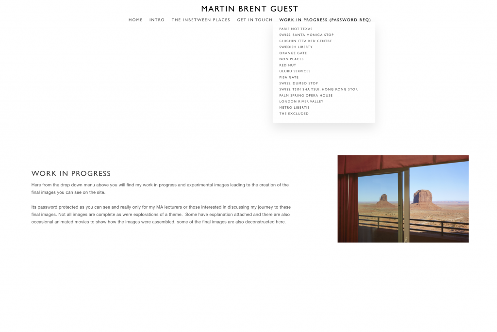
To retain the WIP function Ive been able to move it into a password
protected area and the fnal show images visible upfront after clicking through
from a home page and then the intro page, so two clicks total to see the
imagery which adheres to the ‘three click rule’. Jeffrey Zeldman wrote, in Taking Your
Talent to the Web (2001),
that the Three- Click Rule is “based on the way people use the Web”
and “the rule can help you
create sites with intuitive, logical hierarchical structures”
Drop down menu for WIP
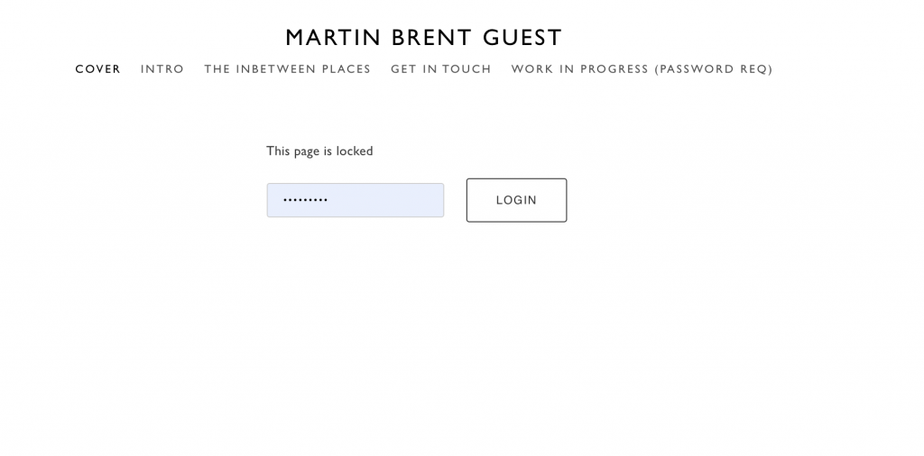
Password Protection for WIP site
Work in Progress description page
The work in progress section gives a per image
description, some background to the image, the idea behind it and some
information about construction with the occasional animation to show how it was
formed.
Only ever envisaged as an aid to the lecturers for the purposes
of evaluation I do not envisage unocking this section for public view and after
the MA is completed this section will be removed alltogether.
Some of the images were only progressed as a test so not full quality, the limitations of placing images onto a web platform is that it seems to confer some kind of completed status, it seems the act of publishing an experiment or work in progress image declares it to be complete as publishing in print of course would.
by brentpix
|
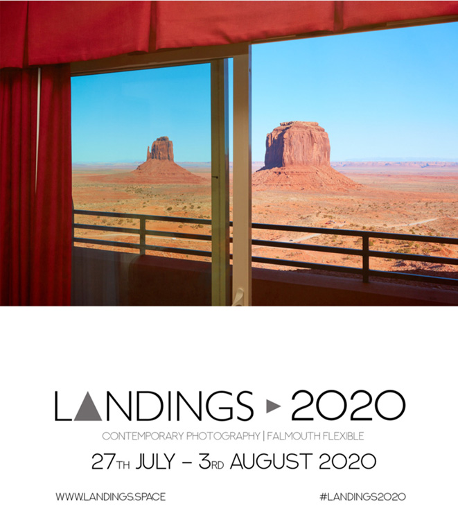
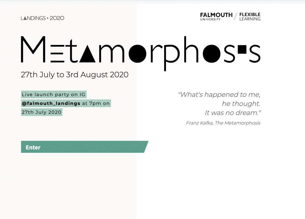
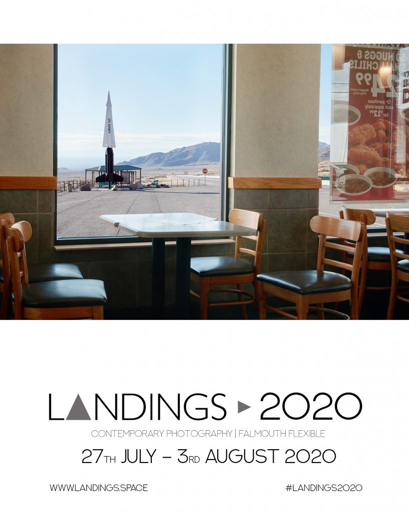
Comments Off on Falmouth Landings 2020
Very please to be taking part in Falmouths graduating students end of year show Landings. This years theme is Metamorphosis and of course actually fits my FMP like a glove. Here is th ebrief.
Microsoft Word – Landings;2020 Theme.docx
“What’s happened to me? he thought. It was no dream.”
Franz Kafka, The Metamorphosis
Over the past six months the world has faced a great deal of change unlike we
have experienced and known in our lifetimes. Some of this change has been
temporary, such as the lockdowns keeping most of the public in the
confinement of their own homes, whilst other changes will become more
permanent and apparent in the future that lies ahead. The effects of this
current situation have been felt within both local and global communities, and
impacted upon our work, leisure, how we interact and communicate with our
friends and colleagues and may be how we live and travel in the future.
Landings:2020 proposes that we are in a liminal stage, a transitional stage,
where even further transformations will be occurring. Our living and working
environment has had a great impact on the photography and art that we have
produced; making us think more creatively than ever and solving problems
where we have been unable to fulfil our initial ideas. Sometimes change can be
positive as well as negative and transform our outlook in ways we never
thought it would.
Therefore, ‘Metamorphosis’ will celebrate the photography we produce in
these transitional times and how we have connected to the landscapes we
have found ourselves in, wherever that may be.
All image Brent Guest M, The Inbetween Places, 2020
by brentpix
|
Comments Off on Public Outcome- In the Covid Age – Books 1
So as the images progress and the theme is now more or less settled deciding on a final publishing outcome needs consideration and indeed action. My options are a show, be it formal in a gallery setting or something maybe in a different environment all together, I always liked the idea of doing something environmental. However since Covid has struck options for physical shows obviously dont exist right or are severely limited to numbers and format at this time so a digital show might be a possibility.
OR I forget about showing the work publicly until conditions improve in favour of making a printed book or other publication for the time being and sharing the images that way.
A book launch event would in normal circumstances be the ideal way to introduce the project and network with old and new contacts but of course this too is not possible at this time however that doesnt mean a book cant be launched, the physical thing can still exist and be shared unlike exhibition prints which obviously cannot.
So what would a book of the Inbetween Places look like? Ive spent a lot of time looking at my favorite photobooks, seeing what works, applying that to the nuances of this project and so on and I have establshed the following:
Image size, they need to be large as the images contain a lot of detail
Clarity of reproduction must be high to convey the detail, its no good making large fuzzy images.
The paper stock needs to compliment the images and be able to carry a wide range of tones and densities successfully throughout the book.
Cost- it has to fit into my available budget.
Imponderables- other factors that may add or detract from the final result.
So lets take a look at some of the books Ive been using for research purposes and what Ive learned from them.
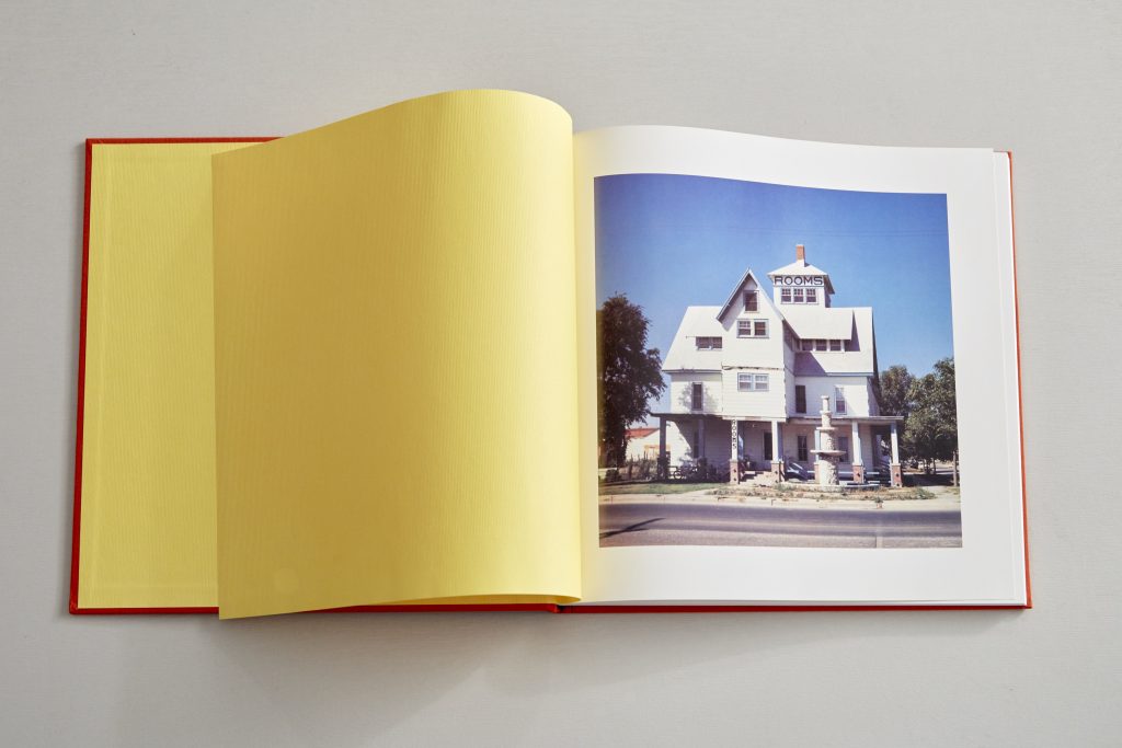
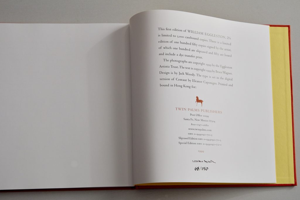
2 &1/4 Square by William Eggleston, the square format echoing the 6x6cm shooting format of the images contained.
2 1/4 William Eggleston, Twin Palms 1999
This is a slip cased signed first edition but reprints have kept the same format and original tipped in print albeit minus the slipcase. Some first editions came with an original dye transfer print, sadly this isnt one of them! The colour scheme is bright, the end papers bright yellow contrasting with the red cloth binding and the same yellow being picked up on the verso 2/1/4 cover imprint. These small details add a lot of quality to the book and enjoyment so I will be keeping this in mind for my own projects.
The images are a nice size, one to a page, I feel the height of the book is sufficient to allow a decent size reproduction and the format being square gives a nice form factor. My images being a landscape format printed to the same height which I think is about the minimum would obviously result in a much larger book. The slipcase I think adds alot to the feeling of quality and the physical process of sliding the book out adds some ceremony. I like slipcases!
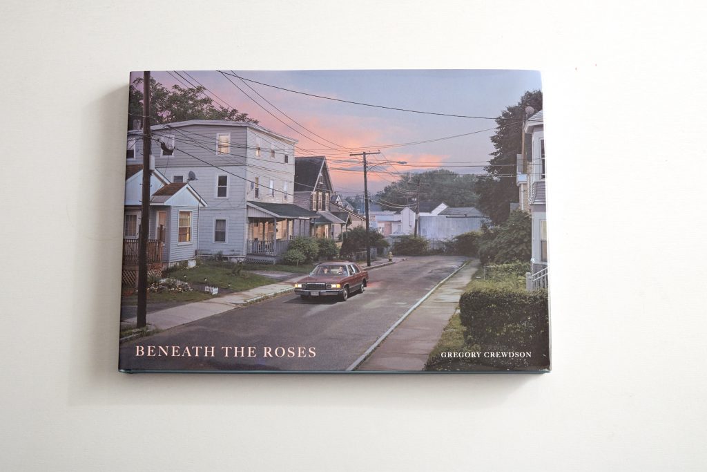
Following that thread I came to Beneath The Roses by Gregory Crewdson. A lavish production by any standards, the same height as 21/4 Square but obviously more than double the width to accommodate the landscape photos
Beneath The Roses, Gregory Crewdson, Abrams, 2007
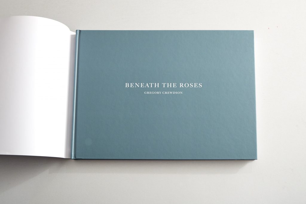
Fitted with a printed dust jacket which gives obvious protection but seems a shame to cover what is a very calming blue soft paper binding which I find far more attractive. Its made me think about the plusses and minuses to having a dust jacket, yes it offers protection but in this case I think it detracts a little from the actual quality of the production.
The cover minus dust jacket
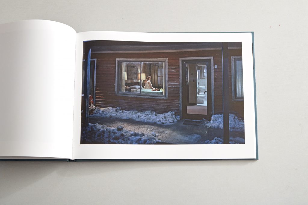
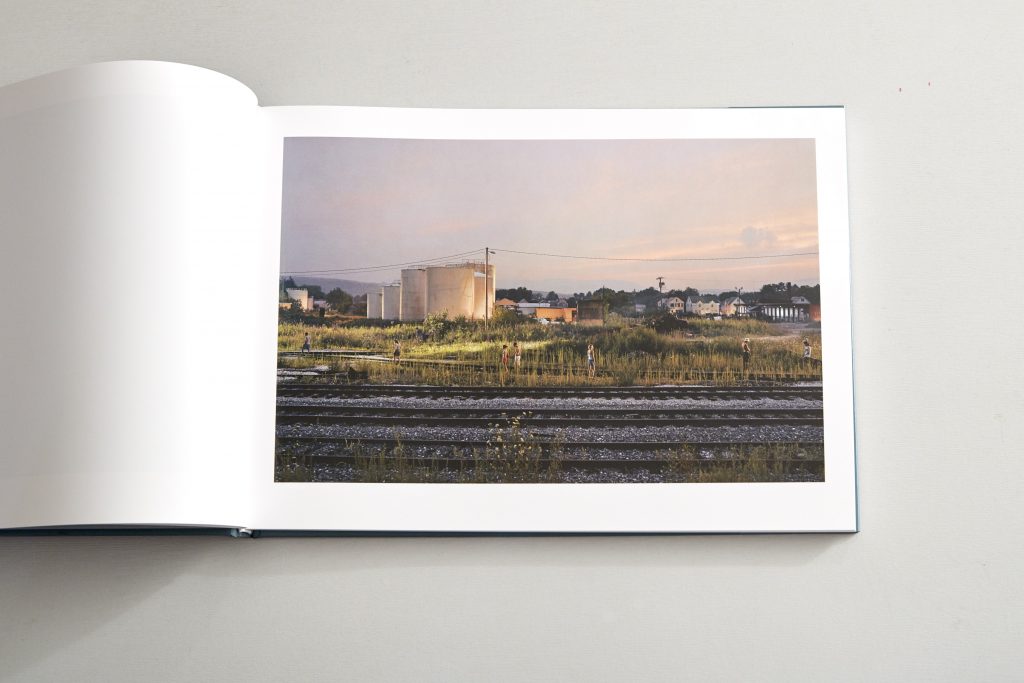
When opened out the book is actually pretty huge, you really do need a decent sized coffee table to support it but the images demand size to enable the mass of gorgeous details to be appreciated, I would say this is the minimum size a Crewdson image could be apprecaited and the quality of the printing is very high and consistent. This was a very expensive production, ideally its what I need to do but vastly beyond my means if self publishing.
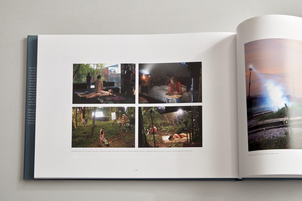
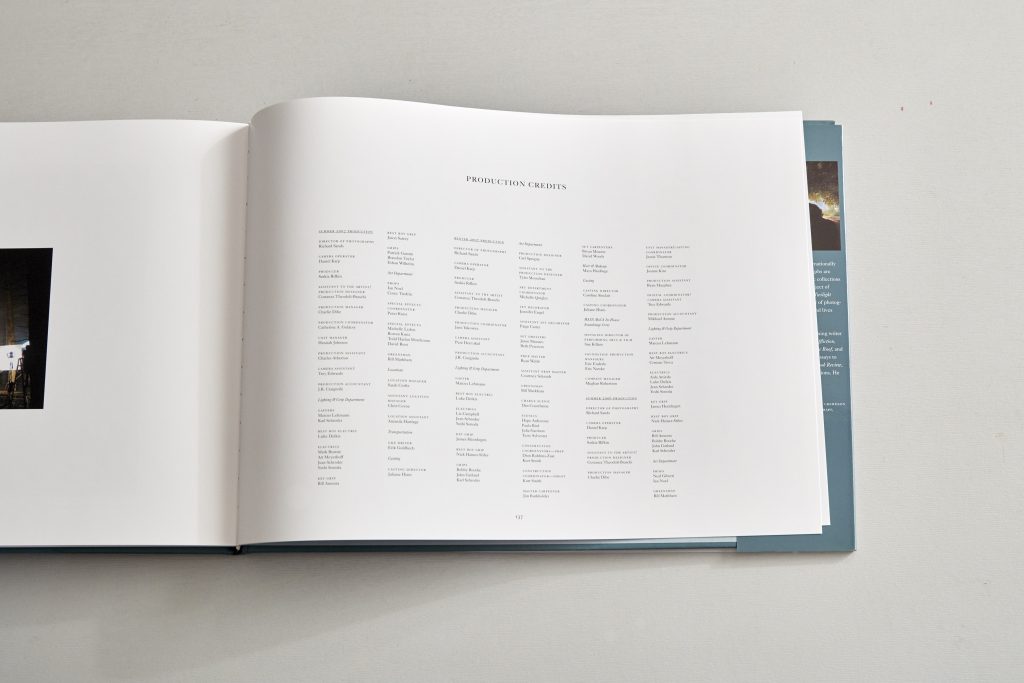
Full list of production credits
Crewdsons images are then, as in earlier books, accompanied by a series of behind the scenes images showing lighting the locations, set building and the models, I like that he’s offering to share his process. He also gives a full list of production credits which shows what a collaborative process making the images was. So although some people say this detracts from his art I disagree, appreciating the constructed nature only adds to the interest for me.
So this is the format I would love but cannot afford!
References.
Eggleston W, 1999, 21/4, Twin Palms Publishers; 1st ed
by brentpix
|
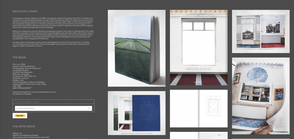
Comments Off on Marwan Bassouni Artist Research
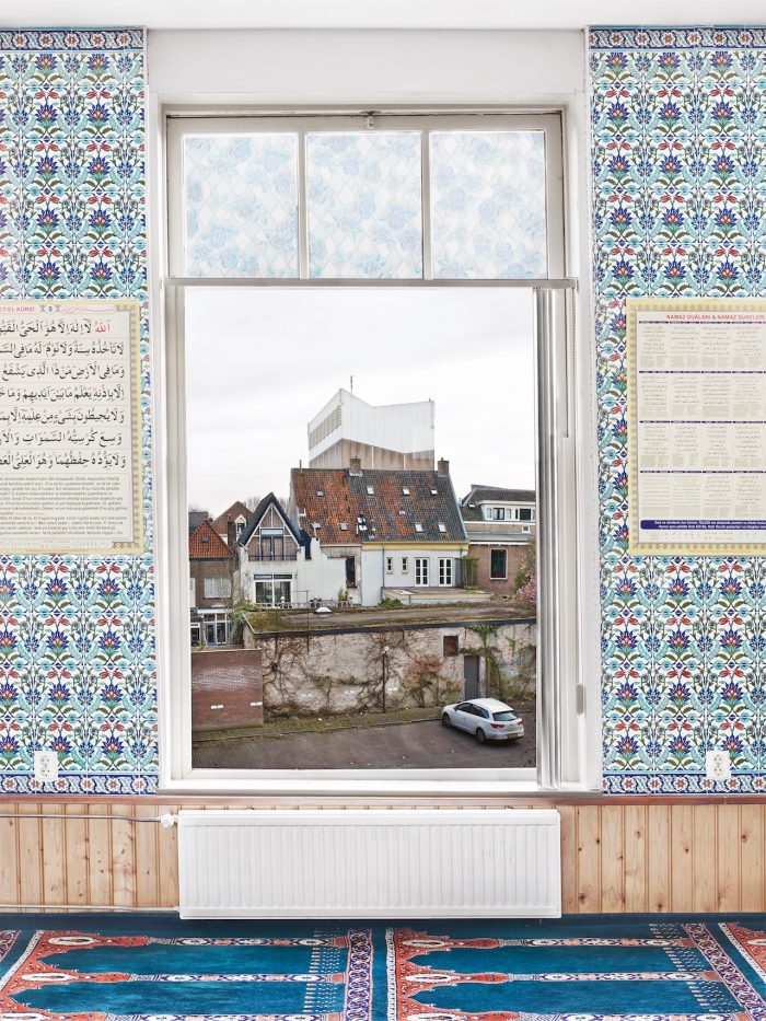
During our 121 Laura pointed me in the direction of Swiss, Netherland based artist Marwan Bassouni. His work really resonated with me both in terms of method, aesthetic and his message.
His Book, New Dutch Views uses composite images to combine the interiors of Dutch Mosques with views from outside although not necessarily the actual view and neither does he stay true to the rules of perspective which helps give a sense of the unreal.
I was also very interested to se the book produced from the project, since he is dealing with images of a similar nature i’m keen to see how other artists are approaching the printed display of their works.
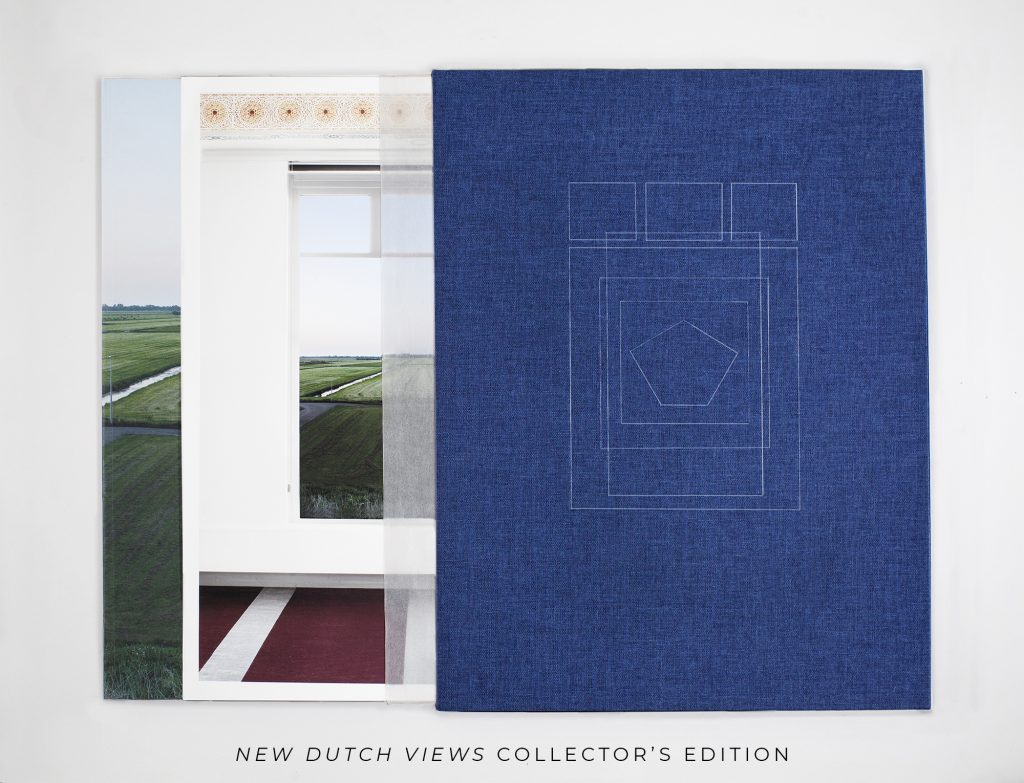
Slipcased edition of 20
Bassoumis production is impressive, neat graphical line drawings representing the windows are used as panels, particularly effective on the slipcase for the limited collectors edition.
But it is whats contained in the book that interestests me most and this description in Concientous magazine sums it up better than I ever could and again I feel real similarities with my own project.
“Photographer Marwan Bassiouni (b. 1985, Switzerland) visited over seventy of the four hundred or so mosques in the Netherlands between January 2018 and February 2019. He made his choice of which spaces to photograph based on the views that their windows had to offer on the local surroundings. His composite images show real interiors combined with the actual view from the mosque. In his series New Dutch Views, Bassiouni shows the diversity of Islam in apparent contrast with the equally diverse yet instantly recognizable Dutch landscape.
Bassiouni’s sharply focused and detailed photographs question how Islam is represented in the West, and show a society in which several cultures exist alongside and with each other. New Dutch Views is also a symbolic portrait of a new emerging Western Islamic identity. In his first solo exhibition at the Photography Museum of the Hague seventeen large-scale photographs are accompanied by the photographer’s own biographical reflections.”