So as the images progress and the theme is now more or less settled deciding on a final publishing outcome needs consideration and indeed action. My options are a show, be it formal in a gallery setting or something maybe in a different environment all together, I always liked the idea of doing something environmental. However since Covid has struck options for physical shows obviously dont exist right or are severely limited to numbers and format at this time so a digital show might be a possibility.
OR I forget about showing the work publicly until conditions improve in favour of making a printed book or other publication for the time being and sharing the images that way.
A book launch event would in normal circumstances be the ideal way to introduce the project and network with old and new contacts but of course this too is not possible at this time however that doesnt mean a book cant be launched, the physical thing can still exist and be shared unlike exhibition prints which obviously cannot.
So what would a book of the Inbetween Places look like? Ive spent a lot of time looking at my favorite photobooks, seeing what works, applying that to the nuances of this project and so on and I have establshed the following:
- Image size, they need to be large as the images contain a lot of detail
- Clarity of reproduction must be high to convey the detail, its no good making large fuzzy images.
- The paper stock needs to compliment the images and be able to carry a wide range of tones and densities successfully throughout the book.
- Cost- it has to fit into my available budget.
- Imponderables- other factors that may add or detract from the final result.
So lets take a look at some of the books Ive been using for research purposes and what Ive learned from them.
2 &1/4 Square by William Eggleston, the square format echoing the 6x6cm shooting format of the images contained.


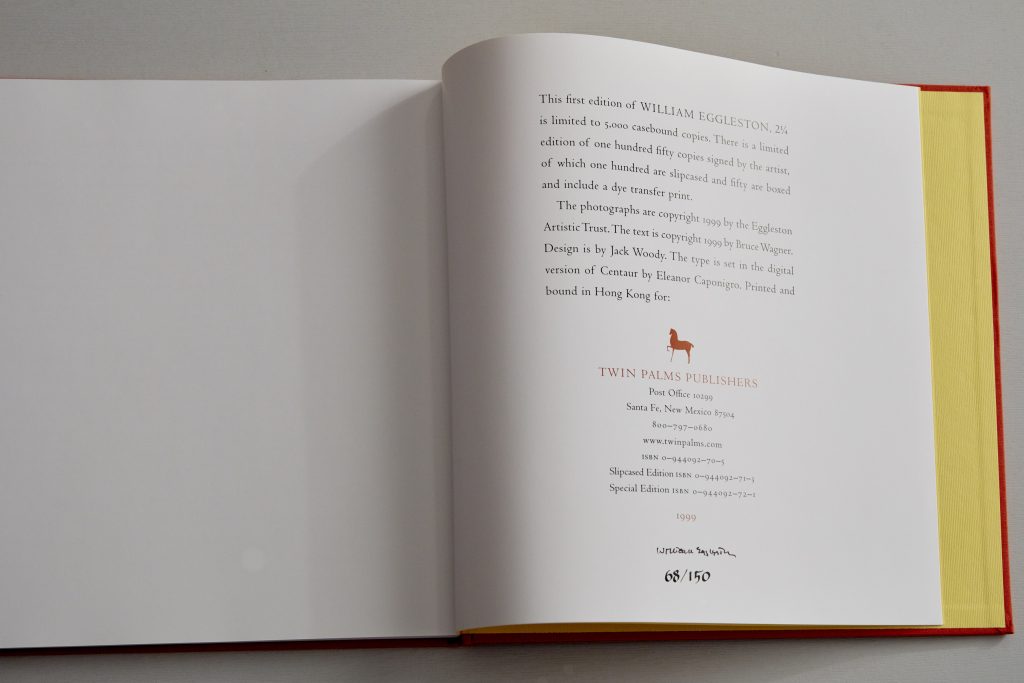
This is a slip cased signed first edition but reprints have kept the same format and original tipped in print albeit minus the slipcase. Some first editions came with an original dye transfer print, sadly this isnt one of them! The colour scheme is bright, the end papers bright yellow contrasting with the red cloth binding and the same yellow being picked up on the verso 2/1/4 cover imprint. These small details add a lot of quality to the book and enjoyment so I will be keeping this in mind for my own projects.
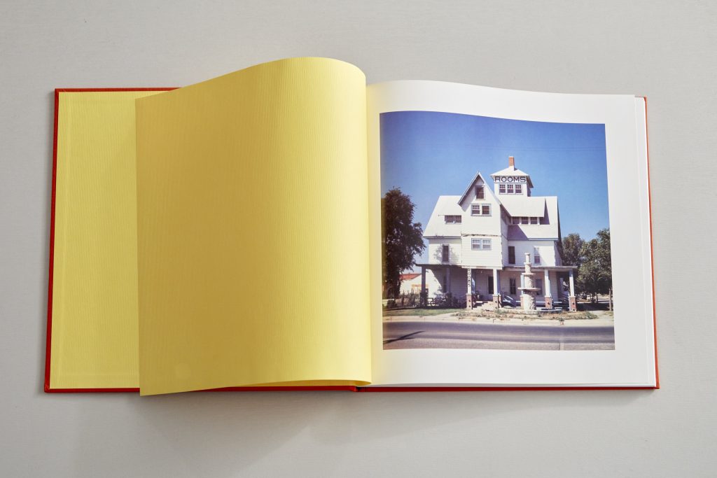

The images are a nice size, one to a page, I feel the height of the book is sufficient to allow a decent size reproduction and the format being square gives a nice form factor. My images being a landscape format printed to the same height which I think is about the minimum would obviously result in a much larger book. The slipcase I think adds alot to the feeling of quality and the physical process of sliding the book out adds some ceremony. I like slipcases!
Following that thread I came to Beneath The Roses by Gregory Crewdson. A lavish production by any standards, the same height as 21/4 Square but obviously more than double the width to accommodate the landscape photos
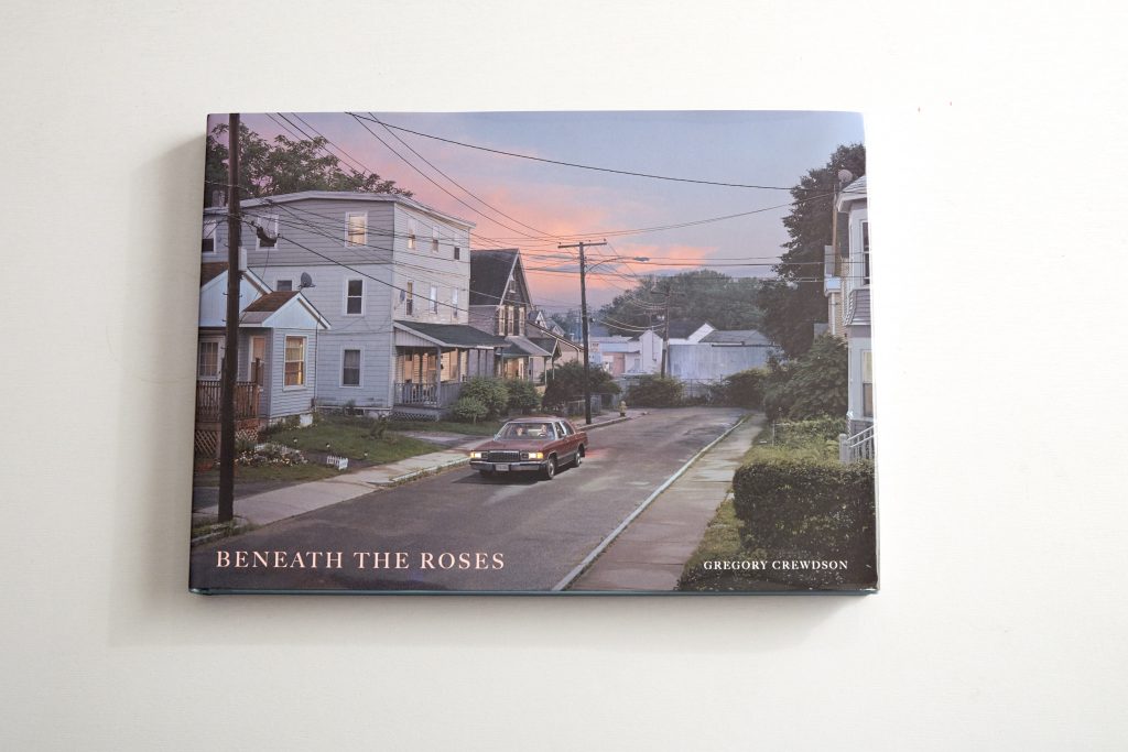
Fitted with a printed dust jacket which gives obvious protection but seems a shame to cover what is a very calming blue soft paper binding which I find far more attractive. Its made me think about the plusses and minuses to having a dust jacket, yes it offers protection but in this case I think it detracts a little from the actual quality of the production.
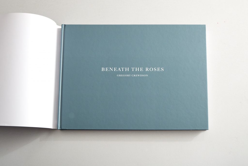
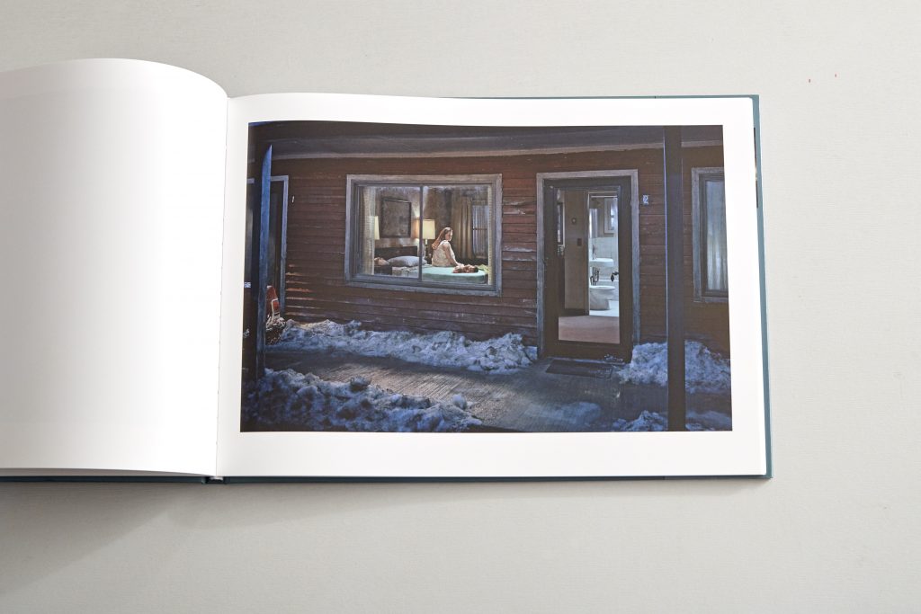
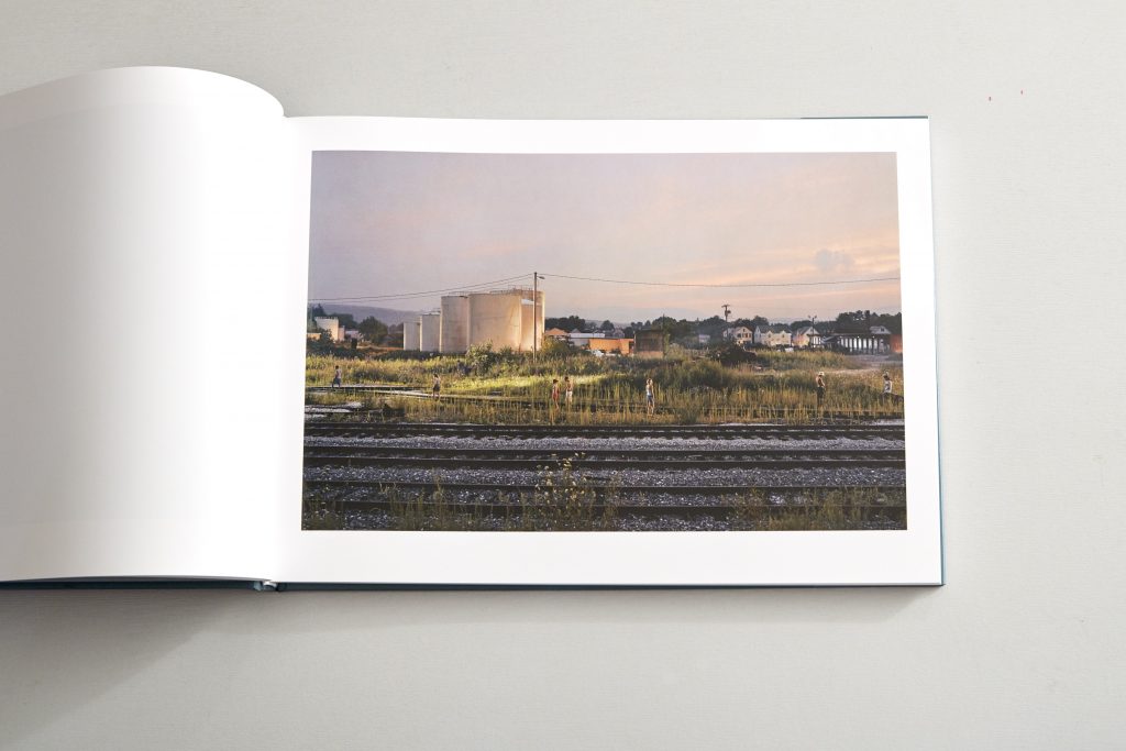
When opened out the book is actually pretty huge, you really do need a decent sized coffee table to support it but the images demand size to enable the mass of gorgeous details to be appreciated, I would say this is the minimum size a Crewdson image could be apprecaited and the quality of the printing is very high and consistent. This was a very expensive production, ideally its what I need to do but vastly beyond my means if self publishing.
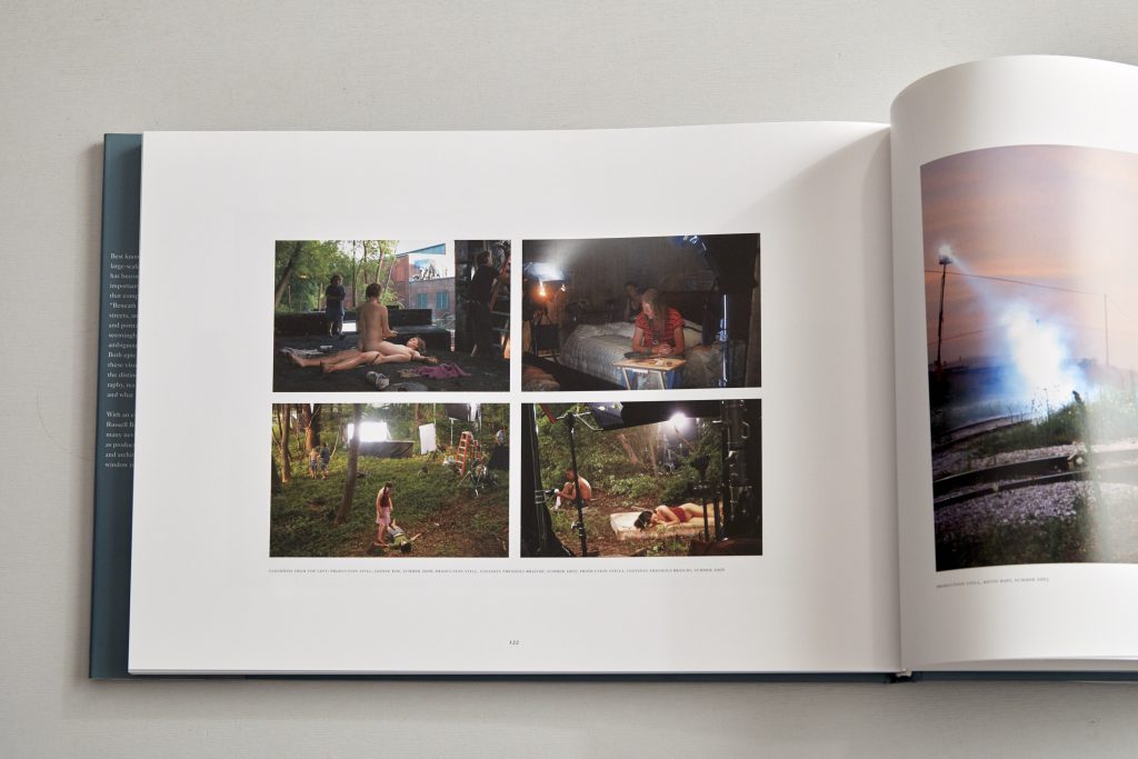

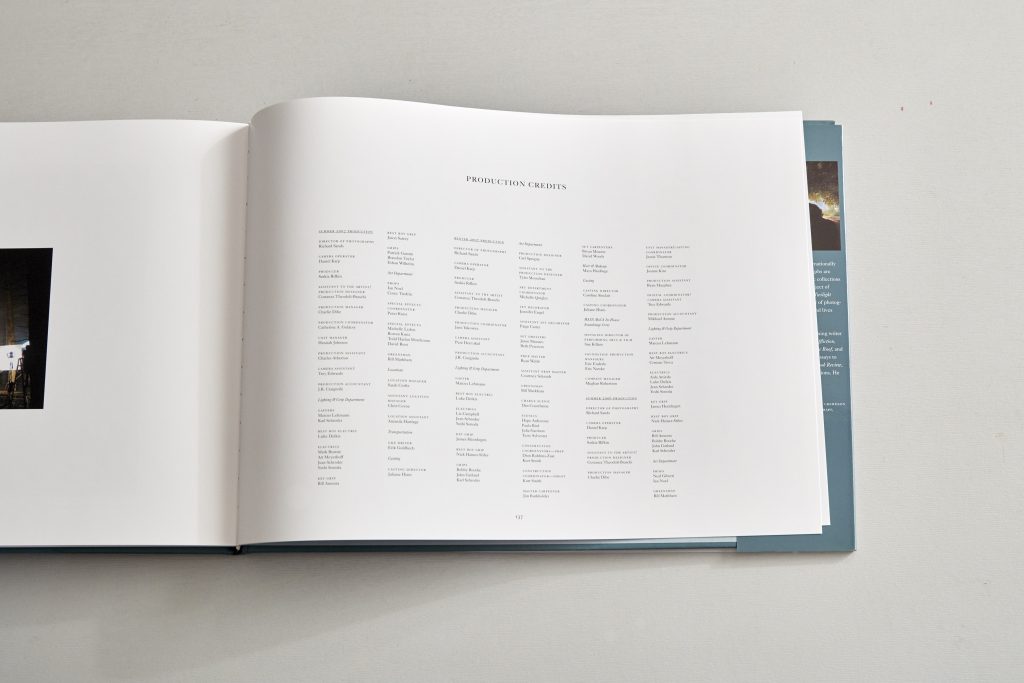
Full list of production credits
Crewdsons images are then, as in earlier books, accompanied by a series of behind the scenes images showing lighting the locations, set building and the models, I like that he’s offering to share his process. He also gives a full list of production credits which shows what a collaborative process making the images was. So although some people say this detracts from his art I disagree, appreciating the constructed nature only adds to the interest for me.
So this is the format I would love but cannot afford!
References.
Eggleston W, 1999, 21/4, Twin Palms Publishers; 1st ed
Crewdson G, 2008, Beneath The Roses, Abrams